Blog

Inflation hasn’t increased US food insecurity overall, according to our new tracker

That’s the title of a new article Sam Polzin and I wrote for The Conversation.

Here’s an excerpt:

Grocery prices soared by 11.8% in 2022 – the swiftest pace since the early 1980s. Rapid inflation is, naturally, leading to concerns that it’s getting harder for Americans to put food on the table.

Indeed, Feeding America, a nonprofit that supports and connects roughly 60,000 food banks and pantries nationwide, has said that at least half of its members are seeing more demand for their services. And many journalists are reporting about struggling parents waiting in long lines for free food.

...

The data we’re collecting ourselves, as well as the information that we’ve compiled from other sources, including the Census Bureau, isn’t yet reflecting a sharp uptick in households without enough to eat. U.S. food insecurity has remained at troubling and yet relatively flat levels.

You can read the whole article here.

Or, if you want to play around with the data dashboard Sam created that compiles multiple measures of food insecurity over time, click here.

Trends in Food Insecurity

In recent months, we’ve experienced some of the highest rates of food price increases since the 1970s. Unless incomes have increased at a comparable rate (which they haven’t), higher food prices imply that consumers’ buying power over food has fallen. That is, consumers cannot afford to buy as much food today as they could in the past. Taken together, all this is reason to keep a close eye on what’s happening to food insecurity.

The official government measure of food insecurity comes out once a year. The most recent release was in October 2022 and corresponded to the year 2021. At that time, the USDA estimated 10.2% of U.S. households were food insecure at some point in 2021. Obviously a lot has happened since then - including a roughly 13% increase in grocery prices.

What is out best current estimate of food insecurity? Is it trending upward?

This is a statistic we’ve been tracking in our monthly Consumer Food Insights Survey we put out in the Center for Food Demand Analysis and Sustainability at Purdue. Despite the arguments above, we haven’t yet detected an uptick in food insecurity rates.

But, maybe something is “off” about out sample, survey, or analysis. Fortunately the Census Bureau started an ongoing “pulse survey” in the wake of the COVID19 disruptions, and they include some questions related to food security (they call their measure “food sufficiency”). Moreover, a few other groups have measured food insecurity rates over the past couple years.

My colleague Sam Polzin has done a masterful job brining together these and a variety of ofther measures of food security from different research groups over the past couple years in the form of a data dashboard that we plan to continue updating.

While there was perhaps an upward trend in food insecurity (or food insufficiency) around the end of last year and the first of this year, food insecurity rates have been fairly flat during most of 2022 (click here if you want to engage with an interactive version of the dashboard).

The result is a bit surprising given the aforementioned increases in food prices and the anecdotal accounts I’ve been hearing from folks working in food banks about being much busier than usual. It is possible that food insecurity hasn’t risen precisely because some of our safety nets have “caught” more vulnerable people and kept them out of food insecurity. For example, SNAP benefits increased in the wake of the pandemic (but are now being scaled back in some states). Still, even in our Consumer Food Insights survey, we are not seeing a trend in the share of people saying they’re getting food from foodbanks.

I’m all ears if someone has a good explanation for the disconnect between the multiple survey-based measures showing stable trends in food insecurity and the reports of longer lines at food banks.

A Thanksgiving Price Dashboard

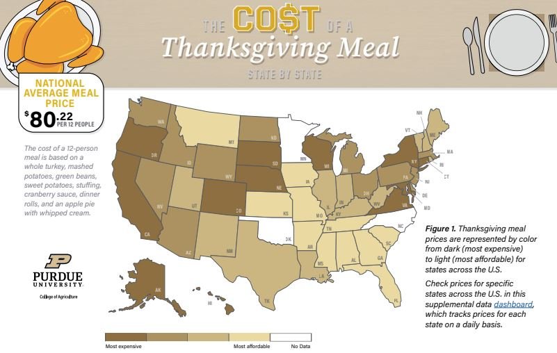
My collaborators and team in the Center for Food Demand Analysis and Sustainability at Purdue have pulled together a couple interesting resources that compare the cost of a Thanksgiving meal across the United States. Check out the infographic here, or the data-dashboard here.

The resources rely on price data we have been scraping from online ordering systems from major grocers across the United States. Our long-term plan is to build out price indices that complement the official Bureau of Labor Statistics food price index; our indices will be timelier and provide information about differences across geography and product characteristics.

For now, I hope you enjoy the Thanksgiving price dashboards. See how prices in your state compare to prices in other states by checking out our data dashboard that will continue to be updated over time. See how conventional turkey prices compare to Organic turkey prices - or even tofu if you prefer a vegetarian option.

Increasing pork price sensitivity amidst rising inflation

In some new analysis of retail scanner data, Glynn Tonsor and I find rising price sensitivity of most pork products in the recent era of high inflation. That’s not true for some products - like bacon.

We tackled this issue in a couple different ways, but the table below shows how pork product elasticities have varied on an annual basis since 2017. So, for example, at the aggregate product level, back in 2017, a 1% increase in the price of pork was associated with a 0.78% reduction in the quantity of pork consumers demanded. This year, that same 1% price increase is associated with a 1.18% reduction in quantity demanded. This heightened price sensitivity has coincided with a period of high economy-wide inflation.

You can read the whole report here.

Cost of a Cheeseburger

Apparently National Cheeseburger Day is just around the corner. My team at the Center for Food Demand Analysis has been working hard pulling together data from all across the country on retail food prices (using web-scraping technology), and we thought we’d put the data to use in calculating the price of a cheeseburger by state. Check out the whole infographic here.

To whet your appetite, here are a couple screenshots. First, the comparison across states.

We also compare national averages across regular, organic, and plant-based burgers.