Blog

Food Flows

Last week I posted some crude calculations on how much states import and export various foods from other U.S. states.  Sandy Dall'erba from the University of Illinois alerted me to a dataset that gets at this question in a different way through records of interstate shipments (the FAF database from the Bureau of Transportation).  Sandy graciously agreed to let me share this figure he created based on these data.

statetradeflows.JPG

You can read more about Sandy's work with Zhanglaing Chen here or contact Sandy to get a copy of their working paper "Drought, Interstate Trade and Agricultural Profit: Theory and Evidence" presented this year at the North American Regional Science Conference in Vancouver.

How Much Does Your State Rely on Other States for Food?

With all the ongoing discussion of benefits and costs of trade and NAFTA, I thought it might be useful to look at some agricultural trade within the United States.  We don't usually think of sending corn from Iowa to Louisiana as "trade" but it's hard to see how it is much different than sending corn, for example, from Iowa to Alberta, except of course for crossing national rather than state boarders.  These sorts of discussions also relate to efforts to move toward local and regional food systems.  How feasible is it, really, for a state to "feed itself"?  

Unfortunately, there simply isn't good data on how much states trade with each other. Thus, I thought I'd make some very crude calculations based on a variety of tenuous assumptions.  First, I'll report what I found and then discuss the details and assumptions I had to make below.  

importexport.JPG

The table above shows my crude calculation of how much a state imports or exports for various food products on a per-capita basis.  For example, for every Iowan, 3,896 lbs of hogs leave the state for every pound that comes in.  Iowa is thus a net exporter of hogs/pork.  By contrast, for every New Jerseyan, 111 lbs of hogs enter the state for every lb that leaves New Jersey.  New Jersey is a net importer of hogs.  By these calculations, 11 states "feed" the other 39 states pork. 

For eggs (this includes both table eggs and hatching eggs because these were the most complete data available at the state level), in Iowa, 3,747 eggs per person leave the state for every egg that enters the state.  These calculations suggest Massachusetts and the District of Columbia are the largest net importers of eggs with more than 300 eggs entering the state/district per person for every egg that leaves.     

For cattle, 18 states "export" lbs of cattle on a per capita basis and the other 32 states import lbs of cattle.  Rice is the most extreme case shown.  Only six US states produce meaningful quantities of rice according to USDA; people in the rest of the US have to import from these locations.

A state like Massachusetts, for example, heavily relies on other states for these four agricultural products.  The average Bostonian imports 110 lbs of hogs, 302 eggs, 130 lbs of cattle, and 62 lbs of rice from other states.  California is a big producer of agricultural products, but it is also a populous state, and as a result, it is also a net importer of hogs, eggs, and cattle.  

***

On the details of the calculations -  I'll admit up front that the figures in the above table leave a lot to be desired.  I'll describe what I've done and leave it to the reader to decide whether there is more information than noise.  

I went to USDA-NASS data and obtained production by state. The USDA doesn't always report production for all states, and in many cases, it withholds reporting for some states due to confidentiality issues.  In these cases, I "fudged" and simply divided the total production that was unaccounted for equally among states for which the USDA did not report data.  

These USDA data yield crude estimates of production by state.  We do NOT have good data on consumption by state, but we do have data on population by state.  Making the assumption that per-capita consumption of various food products is the same in every state, we can then make an inference as to how much of any food product is consumed in a state.  It is simply the share of the US population in a given state multiplied by the total US production of a given agricultural commodity.  The difference in the state production and the inferred state consumption is a crude estimate of net exports/imports into a state.  I then divided the total pounds (or eggs) of net exports/imports by a state's population to put the figures in per capita terms.  

There are some shortcomings with these calculations.  First, I've ignored trade with other countries.  For example, if eggs leave Iowa for Mexico, then the above figures over-state how many eggs are consumed within a given state in the US.  I similarly ignore imports, which will instead under-state how much is imported into certain states.  Also, the figures above suggest per-capita consumption numbers that are substantially higher than that reported by the USDA-Economic Research Service.  The main reason, for beef and pork, is that the USDA production data report farm-level lbs produced by a state not the amount of retail meat lbs.  There is some double counting in these figures.  If an Indiana farmer raises a hog to 20 lbs and then sells it to a finishing operation in Illinois that raises the hog to 200 lbs, then the USDA statistics will say Indian had 20 lbs of production and Illinois had 200 lbs of production, which added together is 220 lbs.  But, there aren't 220 lbs of pork, only 220. The way around this would be to only count retail lbs produced, but the USDA doesn't report this on a state level for pork or beef.  Also, there are a lot of other foods, like vegetables or table eggs, that we might desire to create statistics like those in the above table; however, there is very sparse reporting at the state-level by the USDA, and often the "other states" category has more quantity produced than the total of the quantity specified for named states.   

Benefits and Costs of Local Food Policies

I've been critical of many of the local foods policies that have been touted as solutions to economic, environment, or health problems (e.g., see here or here).  Much of my criticism is rooted in the fact that advocates have failed to meaningfully and accurately articulate how policies to, say, require local schools or hospitals to source food within a certain radius or to subsidize farmers markets will improve the environment or increase a region's economic growth.

In the debate about local foods, proponents and opponents have largely talked past one another, and one of the hindrances to more fruitful dialog is the lack of a formal mathematical model from with people can illustrate the effects they believe to disseminate from promotion of local foods.  While surely not everyone will agree with the details of any particular model and the conclusions coming from it, a model at least provides a starting-point from which one can articulate what they believe the model is missing which would justify or condemn local food policies.

Enter this new paper by Jason Winfree and Philip Watson in the American Journal of Agricultural Economics.  The authors present just such a mathematical economic model in which one can talk about the benefits and costs of local food policies.  They generally show that local food policies are more costly than beneficial.  However, they do show that in certain conditions (if there is a lot of market power and extensive externalities), it is possible (though not necessarily likely), that local foods policies can produce more benefits than costs. 

In a blog post at Oxford University Press discussing their paper, they summarize their findings as follows.   

The formal model generally concludes that the traditional case for comparative advantage remains largely unaffected by these concerns [about the environment, food security, and economic growth]. In fact, in many instances, the buy local movement harms the local economy. One of the basic tenets of economics is that two regions can be made better-off through trade. Buying local generates inefficiencies that reduce social welfare. The policies intended to support the “buy local” movement results in a region producing a good where they do not have a comparative advantage. The costs of policies increase because the locally produced good forgoes the benefits of specialization and the division of labor.

Consider the case of negative externalities generated by foods brought in from distant locales. Proponents claim that pollution generated from transporting non-local goods to local markets justifies their claim. However, if the externalities require some kind of public response, a Pigovian tax makes more economic sense than encouraging “buy local.” The tax addresses the source of the externality. Buying local leaves the externality in place and does not address the inefficiency associated with deviating from comparative advantage.

What if we forced food to be more local?

I recently ran across this paper in Food Policy published back in 2011 by Charles Nicholson, Miguel Gomez, and Oliver Gao.  The paper asks an interesting question: what would happen if we required food (or in this case, milk in particular) to be more local?   This is a policy proposal that has been seriously put forth by prominent food writers.  

The authors took data on current location of milk production, processing plants, and consumers and created a mathematical model to minimize the cost of supplying various dairy products to consumers.  Here's their description of the spatial dimensions of the data:

The model uses 231 multiple-county milk supply regions, each represented with a single centrally-located point. Dairy processing plant locations are specified based on observed plant locations observed in 2005, and vary in number from 319 possible locations for fluid plants (Fig. 3) to 11 for milk protein concentrate products. Demand locations are represented as a single point for 424 major population centers and aggregations of multiple-county regions

Given this set-up, what is the effect of cost of reducing the number of miles traveled - or the weighted average source distance (WASD) - by 10% or 20%?  

The authors find that (in the month of May), requiring a 10% or 20% reduction in WASD would increase total costs by about $1 million and $18 million per month (0.1% and 1.7% cost increases), respectively.  All this is a way of saying that milk production and dairy processing is located in particular regions for a reason, and forcing a different spatial configuration will increase costs.  The authors write:

These relatively small reductions in overall costs contrast with more marked shifts in the allocation of costs within the supply chain. In each case, the costs for assembling milk from farms to plants decreases, as it is optimal to ship milk shorter distances to processing facilities. Costs for interplant shipments increase by about the same magnitude of the increase in total costs. The largest increase in costs occurs in product distribution; increases in distribution costs range from 2% to 25%–6 to 24 times as large as the overall increase in costs.

In other words: the effects are complicated and impose much larger costs on some portions of the supply chain than others.  In terms of the impacts on consumers:

The increases in the value of a gallon of milk due to reduced WASD vary from less than $0.50 (which is often more than 10% of the retail price) in the western US to more than $4.00 per gallon in the southeastern US, but the average for all demand locations is $1.66.

Another interesting result is that even though WASD is reduced over all by 10% or 20%, some dairy products, such as cheese, end up having to be transported even further.  

The authors consider another interesting scenario in which people just want to reduce the distance traveled by fluid milk by 10%.  In this case, total costs increase a whopping 12%, and the WASD for all products actually increases by 98 miles (a 31% increase in distance traveled). This remarkable result shows the unintended result of, for example, local schools requiring their milk be purchased locally without considering what happens to the yogurt, butter, cheese, and nonfat dry milk that will also be consumed by someone.  

The authors conclude as follows:

The primary conclusion is that developing a cost effective strategy to localize a multi-product supply chain is complex. Such complexity accrues to the multiple links that exists in a multi-product supply chain including the relationships across supply chain segments, the dependency of the various products, the diversity in supply and demand across geographic regions, and the seasonality of the production process. Therefore, decision makers should adopt a systems approach to anticipate the consequences of industry wide or public policy initiatives to increase localization in the food industry.

Origins and Evolution of Food

I've seen a number of stories on the research of a team of people at International Center for Tropical Agriculture, the USDA, and elsewhere, some of which was published in a paper in the Proceedings of the Royal Society B and in another paper in the Proceedings of the National Academies of Science (PNAS).  The team aimed to identified where many of our crops originated and how our eating patterns have changed over time. 

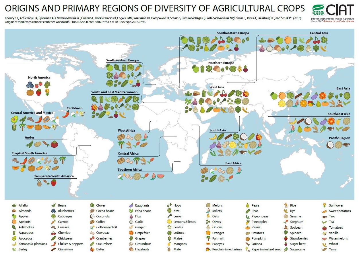
Their website has a number of fantastic, interactive visualizations.  Here's one.  

What I like about the figure above is how it challenges our idea of what is "local" or "authentic."  It also illustrates how much we've gained from trading with people in different parts of the world.  

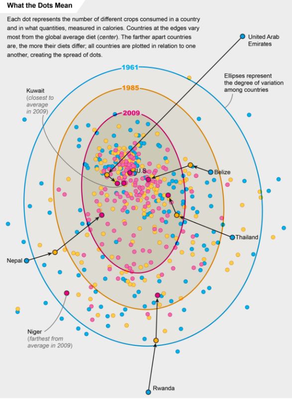
The folks at Scientific American put together this graph based on data in the PNAS article, showing the convergence of dietary patterns worldwide.  

While there might be a temptation to decry the "sameness" brought about by globalism and the loss of cultural foods, the reality is much cheerier.  First, as the initial figure showed, what we think of as "our" cultural foods are probably relatively recent historical constructs.  Second, one of the reasons people eat more similarly to each other across the world is that we are now all eating each other's foodstuffs.  We've taken the best from each country and culture and exported it everywhere, and as a result have more diverse diets.  Finally, this trade has forestalled the doom-and-gloom Malthusian concern, as there has been a near universal increase in calorie availability worldwide.

Here's from the abstract of the PNAS article.

We assess trends over the past 50 y in the richness, abundance, and composition of crop species in national food supplies worldwide. Over this period, national per capita food supplies expanded in total quantities of food calories, protein, fat, and weight, with increased proportions of those quantities sourcing from energy-dense foods. At the same time the
number of measured crop commodities contributing to national food supplies increased, the relative contribution of these commodities within these supplies became more even, and the dominance of the most significant commodities decreased. As a consequence, national food supplies worldwide became more similar in composition, correlated particularly with an increased supply of a number of globally important cereal and oil crops, and a decline of other cereal, oil, and starchy root species. The increase in homogeneity worldwide portends the establishment of a global standard food supply, which is relatively species-rich in regard to measured crops at the national level, but species-poor globally. These changes in food supplies heighten interdependence among countries in regard to availability and access to these food sources and the genetic resources supporting their production, and give further urgency to nutrition development priorities aimed at bolstering food security