Blog

Food Demand Survey (FooDS) Finale - at least for now

Five years ago in May 2013, I put out the first issue of the Food Demand Survey (FooDS).  Every month since that time, a survey of over 1,000 food consumers (a different 1,000 each month), has been conducted where we've tracked concerns, attitudes, and preferences for various food issues over time.  This has been a really fun project.  Alas, all good things must come to an end and the May 2018 edition of FooDS will be the last - at least in its current incarnation.  

Here I wanted to highlight some of the findings we've generated and provide some graphs showing the trends we've observed over the past five years (every issue of FooDS and all the underlying data is available here).  At the end, I'll give a few "thanks" and give insights on where the project may be heading next.  

Some highlights.

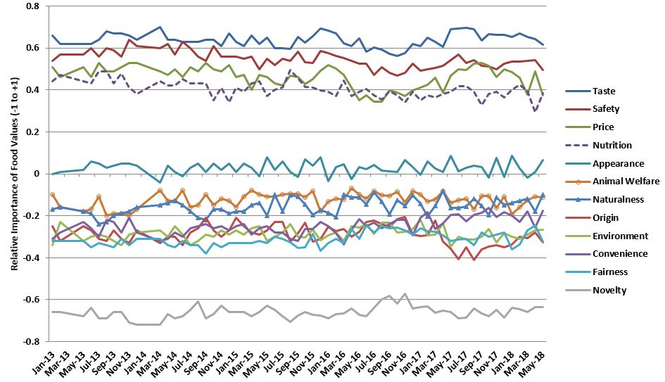
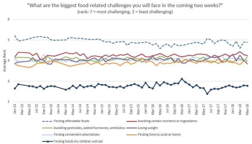
Now for some trends (note: each of the graphs below shows data from at least 1,000 consumers surveyed each month for 5 years for a total of more than 60,000 observations).  Because I've discussed these results many times in the past, I'm going to let these graphs "stand on their own" without interpretation or description of how the data are collected or analyzed.

FooDS_1.JPG
note: "average" is the average of about 16 other issues tracked in the survey

note: "average" is the average of about 16 other issues tracked in the survey

note: "average" is the average of about 16 other issues tracked in the survey

note: "average" is the average of about 16 other issues tracked in the survey

Food Values over Time

Food Values over Time

FooDS_5.JPG
FooDS_6.JPG
FooDS_7.JPG
FooDS_8.JPG
FooDS_9.JPG

Finally, I want to say thanks to Susan Murray who did the heavy lifting every month, Bailey Norwood who helped me conceptualize the project and kept it running for the last year, Glynn Tonsor who provided intellectual capital over the course of the project, and many graduate students who provided great ideas and analysis.  Early on, funding support for the project came from the Willard Sparks Endowed Chair.  Later, the Division of Agriculture and Natural Resources at Oklahoma State pitched in.  For the past several years, funding support came from a USDA-AFRI-NIFA grant.  I've had numerous conversations with Bailey (at Oklahoma State), Glynn (at Kansas State), and Trey (at Michigan State) about the future of the project, where it might "reside", and how it should change to be even more informative.  All the details are yet to be worked out, but I think there is a good chance FooDS will re-emerge in the next several months with a new "home" and focus.  

Food Values of the Rich and Poor

As I've discussed in the past, I've been measuring consumers "food values" in the monthly Food Demand Survey (FooDS) for the past four years.  The way this works is that a list of 12 items is presented to respondents and they are asked which are most and which are least important when buying food.  Respondents have to click and drag four of the items into a "most important" box and also put four in a "least important" box, leaving four in neither box (for exact question wording see page 7 of this document).  

The advantage of this questioning approach is that it requires a tradeoff - respondents can't say all issues are important and they have to indicate some food values as least important.  To create a scale of importance, I simply calculate the percent of times an issue is placed in the most important box and subtract it from the percent of times it is in the least important box, creating a measure that ranges from 100% to -100%.  

Month in and month out, we consistently find that taste, safety, nutrition, and price are the four most important food values and environment, origin, fairness, and especially novelty are the least important.  Issues like appearance, naturalness, animal welfare, and convenience fall in the middle.  

While the above rankings of values are true on average, it is useful to ask: how do food values differ across consumers with different incomes?  This question is important because not all consumers have the same preferences, and the people with the ability and connections to affect public policy (and grocery store bottom lines) may give priority to food issues that are less relevant to people in the lower end of the socioeconomic spectrum.  

To address this issue, I used some statistical analysis to control for differences in age, gender, education, etc. and then compare how people in different income categories rate each food value.  For ease of comparison, I always set the food value of people lowest income category (less than $20,000 in annual household income) at zero and compare how much higher or lower (again on the -100% to +100% scale) people in other income categories are relative to consumers in the lowest category.    
 

Food Values Relatively More Important to the Poor than the Rich

There were three food values for which importance tended to decline with income: price, safety, and taste.  The big one is price.

foodvalue6.JPG

Compared to consumers in the highest income category (more than $160,000/year in household income), consumers in the lowest income category (less than $20,000/year in household income) place 42 percentage points higher level of importance on the price they pay for food.  Recall that the scale only spans from +100 to -100, and as such, this is a huge difference in the importance of price.  The implication is that policies and actions that adversely affect food prices will matter much more to lower than higher income consumers.  This isn't necessarily surprising, but as the above graph shows, the difference in magnitudes is remarkable. 

Lower income consumers also place relatively more importance on food safety than higher income consumers as indicated in the graph below, however the differences aren't as pronounced as that for price.  Note that this doesn't mean high income consumers don't care about food safety per se, only that safety is less important than other food values to the rich compared to the poor.

foodvalue8.JPG

Lower income consumers also tend to place a lower relative value on taste than higher income consumers, however, the differences aren't particularly pronounced (at most a 7 percentage point spread between high and low income).


Food Values Relatively More Important to the Rich than the Poor

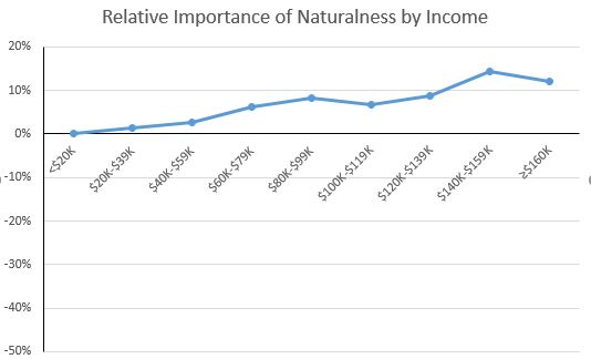
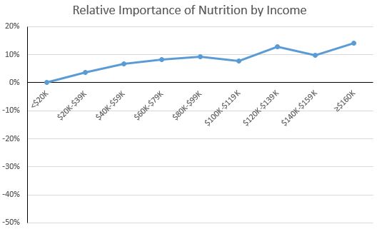
There were five food values for which importance tended to increase with income: naturalness, nutrition, environment, novelty, and origin.

foodvalue1.JPG

As the figure above shows, the highest income consumers placed about 12-14 percentage points higher importance on naturalness than lower income consumers; for nutrition and environment (see below), the results are similar.  

foodvalue2.JPG
foodvalue3.JPG

The environment result is somewhat relevant to debates about the environmental Kuznets curve, which posits that as a country's income increases from a low to mid level, the environment degrades, but then as income increases from a mid to higher level, the environment improves.  One reason cited for the later results is that as people become wealthier, they care more about environmental amenities.  The above graph suggests this is true for the environmental impacts of food production as well.

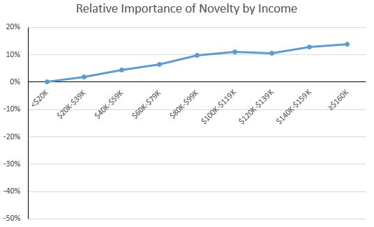
The figure below also shows that higher income households place a higher relative value on the novelty of food than lower-income consumers.  This results is consistent with other research that suggests that lower-income households cannot afford to purchase novel or unfamiliar foods that other household members may not like and that might go uneaten.  That is, higher income households can afford the "risk" of trying new foods that may ultimately go to waste.

foodvalue4.JPG

Testing Public Knowledge about Food and Agriculture

Kudos to Bailey Norwood and Susan Murray at Oklahoma State who have keep the Food Demand Survey (FooDS) alive and well.  In the August 2017 edition of FooDS, they asked a series of questions related to consumers knowledge about food.  The results are fascinating.  

First, they sought to weigh in on the claim that went viral last month: that 7% of consumers thought chocolate milk came from brown cows.  In this month's FooDS, they found only 1.6% of the American public held this belief when given various options for how chocolate milk is made.

Read the whole report for more interesting findings, such as:

  • 23% of respondents thought gluten as a preservative or additive to make bread whiter;
  • 79% correctly knew how soy milk is made;
  • 18% think the sun revolves around the earth (yes, you read that right);
  • 95%+ correctly identified broccoli as a vegetable and beef as coming from cows;
  • only 28% correctly knew that Trump likes his steaks well done (a plurality thought he likes it medium rare);
  • 15% thought I was the secretary of agriculture (no I didn't put them up to this; Sonny Perdue was picked by 37% of respondents and Michael Pollan by 29%)
  • 99% of respondents said they took their answers to the previous questions seriously.  

How Votes on GMO Labeling Change Concern for GMOs

At the annual meetings of the Agricultural and Applied Economics Association last week in Chicago, I saw an interesting presentation by Jane Kolodinsky from the University of Vermont.  She utilized some survey data collected in Vermont before and after mandatory labels on GMOs appeared on products in that state to determine whether consumers seeing GMO labels on the shelf led to greater or lower support for GMOs as measured by her surveys.  

I'm not sure if she's ready to make those results public yet, so I won't discuss her findings here (I will note I'm now working with her now to combine some of my survey data with hers to see whether the findings hold up in a larger sample).

Nonetheless, her presentation led me think about some of the survey data I collected over the years as a part of the Food Demand Survey (FooDS) project.  While I don't have enough data from consumers in Vermont to ask the same question Jane did, I do have quite a bit of data from the larger states of Oregon and Colorado, which held public votes on mandatory labeling for GMOs back in December 2014.  

In particular, I can ask the question: did the publicity surrounding the vote initiative on mandatory GMO labeling cause people to become more or less concerned about GMOs in general?

We have some strong anecdotal evidence to suggest that support for GMO labeling fell pretty dramatically in the months leading up to the vote.  For example, here are the results from several polls in California (including one data point my research with Brandon McFadden generated) on support/opposition to mandatory GMO labeling.  The figure below shows support for the policy was high but fell precipitously as the election campaigning began, and as we all know by now, the policy ultimately failed to garner majority support in California.

There is a similar pattern of support for mandatory GMO labeling in other states where the voter initiatives were held.  However, just because public support for a mandatory labeling policy fell as a result of campaign ads, this doesn't necessarily mean people thought GMOs were safer or more acceptable per se.  Indeed, many of the negative campaign ads focused on possible "paydays for lawyers" or inconsistencies in the ways the laws would be implemented, rather than focusing on the underlying technology itself.  

The Food Demand Survey has been conducted nationwide and monthly since May of 2013.  In November of 2014, two states - Colorado and Oregon - held widely publicized votes on mandatory GMO labeling.  These data can be used to calculate a difference-in-difference estimate of the effect of mandatory GMO labeling vote on awareness of GMOs in the news and concern about GMOs as a food safety risk.

The survey asks all respondents, every month, two questions of relevance here.  First, “Overall, how much have you heard or read about each of the following topics in the past two weeks” with response categories: 1=nothing; 2=a little; 3=a moderate amount; 4=quite a bit; 5=a great deal.  Second, we also ask, “How concerned are you that the following pose a health hazard in the food that you eat in the next two weeks” with response categories: 1=very unconcerned; 2= somewhat unconcerned; 3=neither concerned nor unconcerned; 4=somewhat concerned; 5=very concerned.  One of the 16 issues we ask about is "genetically modified food."

These data allow us to calculate a so-called difference-in-difference estimate.  That is - were people in CA and OR more concerned about GMOs than people in the rest of the country (this is the first difference) and how did this gap change during and after all the publicity surrounding the vote (this is the second and third difference)?  The "treated" group are the people in CA and OR while the "control" group consists of people in all other US states.

To analyze these question, I split the data into three time periods - "before" the vote (the months prior to September 2014), during the vote (Sep, Oct, Nov, Dec of 2014 and Jan of 2015) and after the vote (all the months after January 2015).  There were 485 "treated" people in CO and OR before the vote, 172 in these locations during, and 908 in these locations after (out of a total sample size of almost 49,000). 

In terms of awareness, here's what I found. 

Compared to people other parts of the U.S., people in CO and OR indeed reported hearing more about GMOs in the news during the ballot initiative vote than they did before and after (the increase in news awareness during the months surround the vote was statistically significant at the 0.01 level).

But, here's the key question.  Did the vote increase or decrease concern about GMOs as a food safety risk?  Apparently there was no effect.  The graph below shows, as compared to people in other states where there were no votes, there was actually a small increase in concern for GMOs in CO and OR in the months during the vote (however, the increase was not statistically significant, p=0.36), which then fell back down to pre-vote levels after the vote.  

So, despite evidence that the vote initiative on mandatory labeling led to an increase in awareness of GMOs in the news, it did not substantively affect concern about GMOs one way or the other.

Trends in Animal Welfare Concerns and Meat Demand

I'm preparing a talk at next week's annual meeting of the Agricultural and Applied Economics Association (AAEA) on trends in consumer concerns about animal welfare, and I thought while I'm at it I'd share a few of the results here.  All the results below come from the Food Demand Survey (FooDS), a monthly survey of over 1,000 consumers that has been ongoing for over four years (each of the graphs below contains information obtained from more than 48,000 survey responses).

One of the first things we ask in the FooDS relates to "food values".  A list of 12 items is presented to respondents and they are asked which are most/least important when buying food.  Respondents have to click and drag four of the items into a "most important" box and also put four in a "least important" box, leaving four in neither box.  The nice thing about this questioning approach is that it requires a tradeoff - respondents can't say all issues are important and they have to indicate some as least important.  To create a scale of importance, I simply calculate the percent of times an issue is placed in the most important box and subtract it from the percent of times it is in the least important box, creating a measure that ranges from 100% to -100%.  

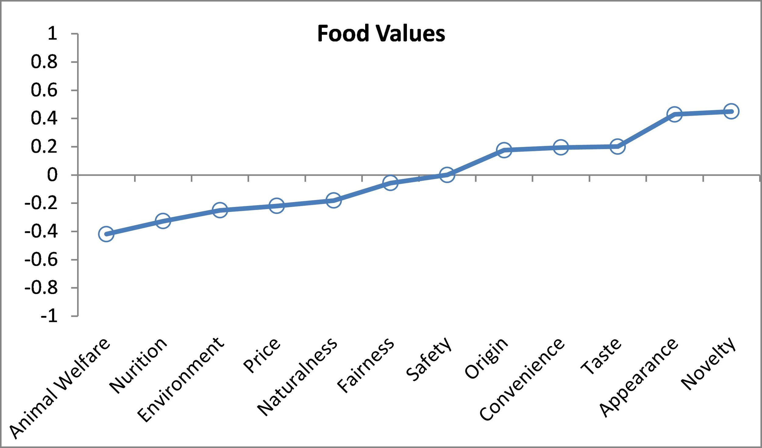
So, where does animal welfare fall in importance?  As the graph shows, it is 7th in the middle of the pack (this graph combines all the data from the last four years).  Animal welfare is much less important than taste, safety, nutrition and price but more important than origin, fairness, or novelty.  About 18% of consumers place animal welfare in the most important box and 31% place it in the least important box, creating a score of 18%-31%=-14%

The importance of animal welfare has increased a bit over time.  Here are the month-by-month averages going back more than four years.  Animal welfare importance has remained fairly stable for the past year, hovering around -10%, but this is higher than in 2013, when it was as low as -20%.

One question that might arise is "so what"?  Do these statements of importance on animal welfare and other food values have any relation to meat demand?  The answer is "yes" - there are some strong correlations.  In FooDS, we also ask people to make nine choices between different cuts of meat (and two non-meat items) at different prices.  A crude index of demand can be calculated as the number of times (out of nine) a meat product, say beef steak, is selected minus the number of times (out of nine) a non-meat item is selected (this produces a measure that ranges from -9 to +9).  Here are estimated relationships between food values and demand for steak and ground beef (controlling for demographics and other factors). 

Relationship between food values and steak demand

Relationship between food values and steak demand

Relationship between food values and ground beef

Relationship between food values and ground beef

The above graphs show that people who have higher concern for animal welfare have lower demand for steak and ground beef (recall the vertical axis is a demand index that ranges from -9 to +9; for reference the mean demand index for steak is 0.9 and the mean for ground beef is 1.32).

Results indicate that if an individual who indicated animal welfare as the most important food value (a score of +1) instead indicated animal welfare as a least important food value (a score of -1), steak would be chosen -0.42 fewer times on average. Similarly for nutrition, results indicate that if an individual who indicated nutrition as the most important food value (a score of +1) instead indicated nutrition as a least important food value (a score of -1), steak would be chosen -0.33 fewer times on average.  Conversely, people who think taste and appearance are relatively important food values have higher demand for steak and ground beef.  Not surprisingly, importance on price is a positive contributor for ground beef demand but a negative contributor for steak demand.   If an individual with the four most favorable food values for steak demand were replaced with an individual with the four least favorable food values, then steak demand would increase by 2.49 (given that the mean is 0.9, this is a very large change). The take-home: to the extent animal welfare increases in importance over time, these results suggest demand for beef will fall (I find similar results for pork and chicken products too).  

By, the way, I can place these food values in the context of other correlates with demand.  Here is a comparison of different determinants of steak demand (the upper left-hand image is the food values graph that was already shown but rescaled so comparisons are made to the lowest impact).  Next to food values, household income, political ideology, and gender have the biggest impacts on steak demand.  Steak demand is higher for higher income and more conservative individuals and for males.  

Correlates with Steak Demand

Correlates with Steak Demand

In FooDS, we also ask, for more than 16 different issues,  “Overall, how much have you heard or read about each of the following topics in the past two weeks” and we classify responses as 1=nothing; 2=a little; 3=a moderate amount; 4=quite a bit; 5=a great deal.  Below are the results pertaining to animal welfare related issues.

Awareness of issues in the news over time

Awareness of issues in the news over time

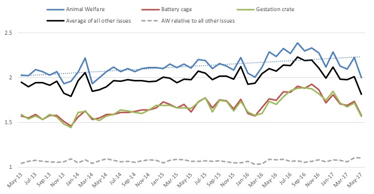
Result seem to suggest an up-tick in awareness of animal-welfare related issues during 2016, which subsequently declined.  However, this increase in awareness also occurred for ALL the issues we track (the solid black line), many of which (like E. Coli, pink slime, etc) have nothing to do with animal welfare.  

A similar pattern emerges in relation to "concern" for the same set of 16 or so issues over time.  We ask, “How concerned are you that the following pose a health hazard in the food that you eat in the next two weeks”, where 1=very unconcerned; 2= somewhat unconcerned; 3=neither concerned nor unconcerned; 4=somewhat concerned; 5=very concerned.  (Yes, I realize, asking whether animal welfare is a "health hazard" is strange, but that's what data I have).  The graph below slows a slight uptick in concern for animal welfare related issues, but this is also true for ALL the issues we track (the solid black line).  In other words, people don't seem to be discriminating much between animal welfare and other food issues.  

Concern for various issues over time

Concern for various issues over time

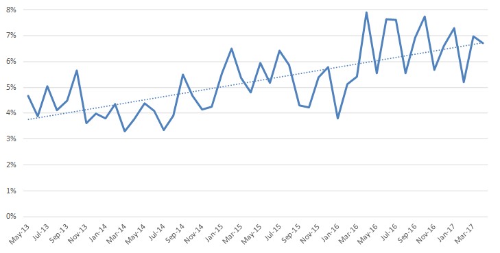
Finally, one of the questions we ask every month is whether respondents are vegetarian or vegan.  There has been an increase in this self-reported measure over time (see here or here for my previous discussions of these data).  In early 2014, the figure was between 3% and 4% of respondents.  This has roughly doubled and we now routinely see values between 7% and 8% of respondents self-identifying as vegetarian or vegan.  

Are you a vegetarian of vegan?  (% saying "yes")

Are you a vegetarian of vegan?  (% saying "yes")