Blog

Food Demand Survey (FooDS) - January 2016

The January 2016 edition of the Food Demand Survey (FooDS) is now out.

Here are a few highlights from the regular tracking portion of the survey:

  • Willingness-to-pays (WTP) for all meat products, except pork chops, were down a bit this month compared to last, but were generally higher than was the case a year ago.  The changes in WTP were generally small and within the margin of error (which varies across meat products but is typically about +/- 7%).  
    • On a related note, my paper with Glynn Tonsor, where we used these WTP choice data to estimate demand inter-relationships is now finally out in the journal Applied Economic Perspectives and Policy (I previously discussed that paper here)
  • There was a large drop in plans to eat away from home in January compared to December.
  • There was also a large drop in awareness of E Coli and Salmonella in the news, and a small drop in concern for these issues as well (a likely Chipotle effect).  The same pattern of results was also true for GMOs and antibiotics.  
  • Two different questions suggested an uptick in concern for farm animal welfare at the beginning of 2016.

Three new ad hoc questions were added to the survey this month.

The three questions inquired about consumers’ perceptions of taste, health, and safety of the eight different food products for which we track WTP.  The first question asked: “How tasty or untasty do you consider the following products, where -5 is very untasty and +5 is very tasty?” Participants were asked the same questions twice more, only the words “tasty or untasty” were replaced with “healthy or unhealthy” and “safe or unsafe”.


Chicken breast was, on average, perceived as most healthy and as the most tasty. While beans and rice were perceived as the safest option, it was also the least tasty of the eight choices. Participants perceived deli ham was, on average, one of the least healthy, least tasty, and least safe products. Pork chop and chicken wing fell in the middle for each of the three categories. On average, all six meat products were perceived as less safe than the two non-meat products.

The average perception of taste can be plotted against average perceived health or
average perceived safety.

There is a slight positive correlation between perceived taste and health (correlation
coefficient of 0.15).  Similar plots reveal a slight negative correlation between perceived taste and safety (correlation coefficient of -0.14) and a strong positive correlation between perceived health and safety (correlation coefficient of 0.83).   All of this of course is at the aggregate level; plots like this could be created for each and every one of the 1,000 respondents.

What the above graph shows is that although beef products rate relatively well in terms of taste, they fall well below chicken breast in terms of perceived health.  I can use my demand model estimates (the model that gives rise to the WTP values) to do some thought experiments.  What if ground beef was perceived as healthy or as tasty as chicken breast?  How much would WTP for ground beef increase?  

First, we have to ask how much people value improvements in taste, health, and safety.  My model estimates suggest, unsurprisingly, that the higher the perceived taste, health, and safety, the higher the WTP for a product. But, by how much?  I find that a 1 unit increase in perceived taste (on the -5 to +5 scale) has about twice the impact on WTP as a 1 unit increase in safety (again on the -5 to +5 scale) and about the 1.4 times the impact on WTP as a 1 unit increase in perceived health (again on a -5 to +5 scale).  So, changes in perceived health have a bigger impact than changes in perceived health, which in turn has a bigger impact than changes in perceived safety.

All that would seem to suggest that  meat industry organizations would want to focus on improvements in perceived taste.  And that's true.  Increasing the perceived taste of pork chops by 1 unit, for example, would increase WTP by $0.36, whereas increasing perceived health by one unit only increases WTP by $0.25 (note: the mean WTP for chops was about $3.94 this month).

But, it is also important to note that there are larger differences in perceived healthiness across the meat products than there is in perceived taste or safety.  This leads me back to the question I asked earlier: What if ground beef was perceived as healthy or as tasty as chicken breast? How much would WTP for ground beef increase?  Here are my projections based on the model estimates and average perceptions.  

If ground beef had the same average taste perceptions as chicken breast, WTP for ground beef would increase $0.09.  If ground beef had the same average health perceptions as chicken breast, WTP for ground beef would increase $0.45.  If ground beef had the same average safety perceptions as chicken breast, WTP would increase $0.11.  For reference, average WTP for ground beef was $4.36 this month.  

The last thing I'll note is that it's not all about perceived taste, health, and safety.  Average WTP for steak, for example, is about $7.43 whereas average WTP for chicken breast is only $5.34.  How is it that people are willing to pay more for steak than chicken breast when they tell us that they think chicken breast is tastier, healthier, and safer?  The answer is that people care about other stuff than just these three things.  There's just something that makes a steak a steak and a chicken breast a chicken breast that is hard to put in words.  Call it "steakyness"  (not to be confused with the popular dance move).  Of the roughly $2 premium people are willing to pay for steak over chicken breast, about 20% can be explained by taste, health, and safety perceptions, and the other 80% is a desire for "steakyness."

Food Demand Survey (FooDS) - December 2015

The December 2015 edition of the Food Demand Survey (FooDS) is now out.

Some observations from the regular tracking questions:

  • Compared to last month willingness-to-pay for all products, particularly beef products, was up.
  • There was a sizable drop in the proportion of respondents who say they plan to eat out more in the next two weeks.
  • There was again a big spike in awareness and concern for E. Coli and Salmonella, likely as a result of the publicity surrounding the Chipotle outbreaks,
  • There was a large increase in visibility of GMOs in the news in the past two weeks.
  • The fraction of respondents who said they suffered from food poisoning doubled compared to last month.

Three new ad-hoc questions were added this month.

The first set of questions dealt with consumers perceptions of different animal welfare labels. Respondents were asked: “Which of the following labels, if seen on a meat or animal product in a grocery store, do you think would indicate and assure the highest and lowest levels of farm animal welfare?”

Participants were then shown images of nine different labels (randomly ordered across surveys) and were asked to click three labels and move them to a box indicating the highest level of animal welfare and then click three of the labels and move them to a box indicating the lowest level of animal welfare.

Here's what we found.


More than half the respondents put the following three labels in the highest welfare category: Certified Humane, Animal Welfare Approved, and American Humane Certified. Two labels, 100% natural and non-GMO verified had nothing to do with animal welfare and they were generally ranked neither high nor low. The largest percentage of respondents placed the Tyson brand label in the lowest animal welfare category, but it had more “highest welfare” category placements than Global Animal Partnership or Food Alliance Certified. The Global Animal Partnership label (which showed a Step 4 rating) was most likely to not be placed in either
the the highest or lowest welfare categories.

The next set of questions were added to investigate issues related to consumer aversion/acceptance of GMOs and perceptions of corporate involvement and control.  The questions came about as a result of a Q&A after a talk I game in Amsterdam last month at the Conference on Coexistence between Genetically Modified (GM) and non-GM based Agricultural Supply Chains.  In particular, Norbert Wilson from Auburn followed up and helped devise the following questions.  

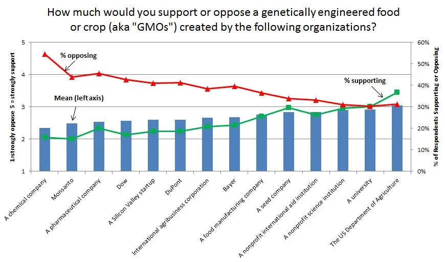
We first asked, “How much would you support or oppose a genetically engineered food or crop (aka “GMOs”) created by the following organizations?” Then, fourteen different entities were listed (in random order across respondents), some of which were specific company names and others that were generic entities.  Respondents replied on a 1 to 5 scale ranging from strongly oppose to strongly support.


GMOs from a chemical company, Monsanto, and a pharmaceutical company were the were least supported. GMOs from a non-profit scientific organization, a university, and the USDA were most supported. For the latter two categories the percentage of respondents supporting equaled or exceeded those opposing. 

Finally, the last question asked, “Of all the possible benefits that arise from the genetically engineered (or “GMO”) food and crops currently being produced, what percent of the benefits do you believe go to the following entities?” Eight different groups were listed (in random order), and respondents had to allocate 100 points across the groups.


Respondents thought seed, chemical and farm input suppliers received the largest share of the benefits (at 17.7%) followed by governments and food processors (each at about 15%). Farmers were next at almost 14%. At the bottom were consumers (10.6%) and universities (8.7%). 

Who consumers think benefits from GMOs appears to have some relationship with concerns and acceptance of GMOs.  Recall, one of our standard questions asked every month is how concerned that GMOs pose a food safety risk in the next two weeks.  When we calculate correlations between GMO concern and the distribution of benefits from above, there are some statistically significant correlations.  The larger the perceived benefits to consumers and farmers, the lower the perceived concern about eating GMOs.    

Similarly, the correlations between the average level of support for GMOS made from the 14 entities indicated above and perceptions of who benefits are shown in the following table.  People who think universities and consumers benefit more from GMOs are more likely to support GMOs.  By contrast, people who think seed, chemical, and farm input suppliers and governments benefit more are less likely to support GMOs.

Food Demand Survey (FooDS) - November 2015

The November 2015 edition of the Food Demand Survey (FooDS) is now out.

A few highlights from the tracking portion of the survey:

  • After a dip last month, WTPs for all products are back up in November.
  • There was a BIG increase in awareness of E. Coli in the news in the past two weeks, perhaps due to the discussion surrounding the Chipotle. 
  • Despite the increase in awareness of E. Coli in the news, there was not a big change in concern about the issue.
  • Consumers expect higher meat prices and expect to consume less meat in the next two weeks as compared to October.

Three ad hoc questions were added in response to the news a couple weeks ago that the International Agency for Research on Cancer, IARC) for the World Health Organization classified red meat as probably carcinogenic.  

First, were a few questions meant to determine the tradeoffs people make between the taste of food, how long they live, cost, and food safety.   

This was done by posing the following scenario: “Imagine you could live anywhere in the world. Suppose there were eight different locations you could choose from that were similar in all respects except for the types of food available. For each of the following eight locations, please rank how desirable it would be to live there.”

Then, eight options were presented (in random order) that varied food cost (at 10% to 20% of after tax income), taste (either better or worse tasting than you're used to), chance of foodborne illness (either 1 or 3 foodborne illnesses per lifetime), and life expectancy (either 75 or 85 years old) of different hypothetical locations.  There are 2^4=16 possible different locations, and I showed people 8 of these such that none of the characteristics were correlated with the others.

Statistical analysis indicates the following formula (all coefficients except the intercept are statistically significant at the 0.01 level) implied by respondents' rankings:

(9-ranking)=desirability of location=0.10-0.035*Cost+1.31*BetterTaste-0.52*#Sicknesses+0.066*Age.

So people dislike higher food costs and foodborne illnesses, and they like better tasting food and living to older ages.  No surprise there.  The interesting questions relate to the magnitudes.

The results reveal people would be willing to pay about 38% higher food prices for better vs. worst tasting food (1.31/.035) and would give up 20 years of life expectancy to live with better tasting food (1.31/0.066). An extra case of foodborne illness is equivalent to about 15% higher food prices in terms of satisfaction with a location (0.52/0.035).

Looking at how rankings can change by moving from the lowest to the highest level of each characteristic suggests taste is the most important issue followed by safety, then life expectancy, then cost.  The results reinforce what we already know: some people will continue to eat bacon even if the IARC says it increases the risk of cancer because they like how it tastes.

The next set of questions focused more specifically on whether people thought different issues could cause cancer, and then how many cancers the issues caused.  In short, I tried to separate out (as the IARC does) the certainty with which we know whether something causes cancer from the size of the effect: that is, how much does a substance increase your cancer risk (see my previous discussion on this).

More humorously, Ted Underwood put it this way on Twitter: 

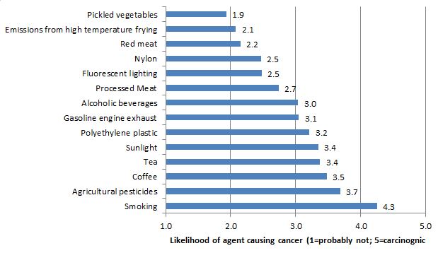
In any event, I asked “How much evidence do scientists have that each of the following items causes cancer?” Using the classification scheme used by the International Agency for Research on Cancer (IARC), respondents were asked whether they believed each item to be carcinogenic to humans (5), probably carcinogenic to humans (4), possibly carcinogenic to humans (3), carcinogenicity not classifiable (2),  or probably not carcinogenic (1).

Most issues, including red and processed meat, were most rated as “possibly carcinogenic” (The FooDS report has the % in each category; here's a nice figure of how the IARC actually classifies different substances).  Here how the different issues I asked about lined up in terms of respondents' perceptions.

While the above was meant to measure certainty of evidence (i.e., the p-value), the last question was meant to measure effect size.  Respondents told: “According to the American Cancer Society, there will be about 1.6 million new cancer cases in the United States this year. What percentage of those new cancer cases do you believe are caused by the following items?”

On average, respondents stated that approximately 30% of new cancer cases each year are due to smoking. Respondents stated that 14% of new cancer cases were due to other factors not listed. Processed meat was thought to be the cause of 6.5% of new cancer cases, while red meat was stated to be the cause of 5.8% of new cancer cases and tea ranked the lowest for causes of new cancer cases at 1.7%. 

Despite the fact that the two questions are meant to measure different things, people probably conflate the two things in their minds (which is why this piece in the Atlantic said the IARC's classification is “confusogenic to humans.”).  Here are the mean answers from the 1st question plotted against the mean answers to the 2nd question.

The correlation between the two is 0.62.  Even removing smoking, the correlation is 0.33.  That is, people tend to conflate the certainty of the evidence with the size of the effect.   

Food Demand Survey (FooDS) - October 2015

The October 2015 edition of the Food Demand Survey (FooDS) is now out.

There were sizable declines in willingness-to-pay (WTP) for all food products; meat and non-meat alike.  At this point, it's unclear what is driving the decline because other measures on the survey, such as food expenditures both at home and away from home remained steady and slightly increased.  In the coming months, I hope to find time to do some serious analysis on effects of seasonality and day-of-week effects given that we now have about two and a half years of data.

Another notable result from the survey is a decline in price expectations for beef, pork, and poultry.  In some cases, the percentage of people anticipating higher prices is less than half of what it was a year ago at this time.  

Consumers reported hearing more about antibiotics and less about Salmonella in the news this month.  

Several new ad hoc questions were added to the survey this month. One set of questions related to food waste. These will be reported separately at a later date.

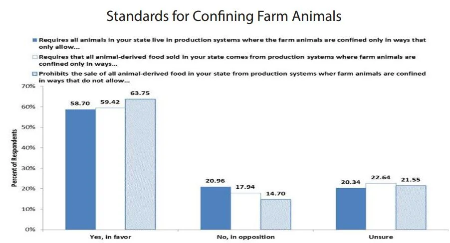
Another set of questions dealt with consumers’ opinion on policies related to farm animal confinement, similar to Proposition 2 that passed in California in 2008. Of particular interest was whether the framing of the issue affected voting outcomes.

Respondents were randomly allocated to one of three conditions. One third of participants in the first condition were asked to vote on an initiative that: “requires that all animals in your state live in production systems where the farm animals are confined only in ways that allow
these animals to lie down, stand up, fully extend their limbs and turn around freely.”

Respondents in the second condition were asked a similar worded question except it was framed as a ban on the sale rather than production. The initiative: “requires that all animal-derived food sold in your state comes from production systems where farm animals are confined only in ways that allow”.

Respondents in the third condition were asked the same question as in the second condition but “requires” was replaced with “prohibits”. The initiative: “prohibits the sale of all animal-derived food in your state from production systems where farm animals are confined in ways that do not allow”.

Participants were asked to respond “Yes, in favor”, “No, in opposition”, or “Unsure”.

Overall, the majority of respondents stated they would vote “Yes, in favor” in each of the three conditions. Despite the very different implications of the first and second initiatives, voting outcomes were nearly identical in the two conditions. In fact, framing had very little effect, aside from a “prohibition” eliciting more yes votes than a “requirement”. 


Food Demand Survey (FooDS) - September 2015

The September 2015 edition of the Food Demand Survey (FooDS) is now out.

Compared to last month, consumer willingness-to-pay (WTP) fell for all the products (meat and non-meat alike) on our survey.  Among meat products, WTP for deli ham witnessed the highest percentage decrease of approximately 21%.  Steak only saw a slight decrease from last month at approximately -2.5%.  

These reductions in WTP might seem problematic for meat industry participants but it is useful to put these in a longer context.  WTP for steak, chicken breast, deli ham, and chicken wing are all higher relative to this time last year. Here is a graph of the WTP values since the beginning of FooDS.  While there are ups and downs, the overall trends are positive for each of the meat cuts shown below, and in fact, last month was the highest WTP observed for several meat products since we started the survey over two years ago.   

We observed a noticeable uptick in consumer awareness of Salmonella in the news this month - likely a result of widely publicized Salmonella outbreaks.  Interestingly, however, concern for Salmonella did not increase this month compared to last.  Concern for GMOs was down a bit this month.  

Several new ad hoc questions were added to the survey this month.


One set of questions related to food waste.  These will be reported separately at a later date.


Another set of questions dealt with consumers’ satisfaction with farmers and agriculture, and the survey was designed to see how the framing affected satisfaction.  The questions came about after a conversation with Mary Ahearn at USDA-ERS. 

Respondents were randomly allocated to one of three conditions.   In the 1st condition, participants were asked: “How satisfied are you with the decisions and manage practices of farmers these days?" Respondents in the 2nd condition were asked the same question but the words “of farmers” were replaced with “of agricultural producers”.  Respondents randomly allocated to the 3rd condition were asked the same question but the words “of farmers” were replaced with “in agriculture”.  

All responses were on a 1 to 10 slider scale where 1 was “completely dissatisfied” and 10 was “completely satisfied.”


Overall, respondents were more satisfied than dissatisfied with farmers, producers, and agriculture, with means higher than 5 our of 10 for all three.  However, respondents were affected by framing.   On average (on the 1 to 10 scale), there was greater satisfaction with “farmers” at 6.63 than for “producers” at 6.29 and than for “agriculture” at 5.93.  

Whereas almost 10% expressed 10=completely satisfied for “farmers”, only 5.8% said the same of “agricultural producers”, and only 5.5% of “agriculture.”  Here's the entire distribution of responses.