Blog

Food Demand Survey (FooDS) - June 2016

The results from the June 2016 edition of the Food Demand Survey (FooDS) are now in.  

In terms of the monthly tracking portion of the survey, willingness-to-pay (WTP) decreased for all food products in June compared to May. This is the third month in a row that WTP has fallen for steak, chicken breast, and chicken wing, and the fourth month in a row that WTP has fallen for pork chops and deli ham. 

There was a sizable increased in awareness of GMOs in the news this month, as was also the case for battery cages and beta-agonists.  The largest percent increase in concern was for bird flu and farm animal welfare. The largest percent decrease in concern was for cancer and meat consumption, antibiotics, and E. coli. 

Several new ad hoc questions were added this month.

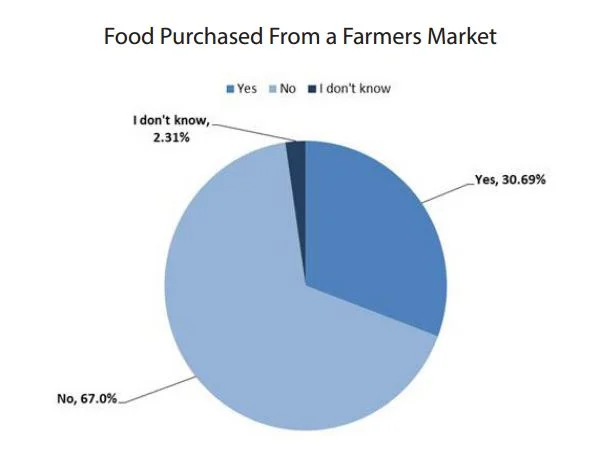
First, I followed up on some questions I'd previously asked in response to some research conducted by Marc Bellemare at University of Minnesota on food safety and farmers markets. In particular, participants were asked: “Have you or anyone in your household bought and eaten food from a farmers market in the past two weeks?”

Approximately 67% of participants stated they have not purchased food from a farmer’s market in the past two weeks. Less than one third of participants stated they have purchased food from a farmer’s market in the past two weeks. 2.31% of participants stated they did not know if they have purchased food from a farmer’s market in the past two weeks.


Here comes the interesting part.  The people who shopped or ate at farmers markets were much more likely (20% vs. 2.5%) to say they had food poisoning in the past two weeks than people who did not eat or buy food at a farmers market. I'm surprised the difference is so large, but the results are perfectly in line with Marc's research.  

There are other demographic differences as well.  People who shopped or ate at farmers markets were more likely to be male (55.6% vs. 26%), to be on SNAP - aka food stamps - (24.1% vs. 14.5%), not be from the Midwest (90% vs. 80%), to have higher incomes ($91,167 vs.
$67,607), be younger (39 vs. 20 years of age), and be more liberal (3.4 vs. 2.9 on a 1 to 5 scale) on average than are people who did not shop at farmers markets. 

Next, a couple questions were added on food waste.  Participants were asked “Of all the food you buy at grocery stores and supermarkets, what percentage would you estimate is thrown away uneaten?” 

About 80% of respondents said they throw away some portion of food that has been uneaten. Only about 20% said they threw away no food. About 60% of the sample said they throw away 10% of the food they buy or less. Only about 10% of respondents said they threw away 50% or more of the food they purchased. Across all respondents, the average percentage of food purchased that was eventually thrown away was estimated at about 17%. 

Finally, there's been a lot of hand wringing on the possible effects of different sell-by, use-by, and expiration dates on food waste (e.g., witness this report from The Harvard Food Law and Policy Clinic (FLPC) and the Natural Resources Defense Council (NRDC).

To explore this issue, respondents were randomly split into four groups and asked: “Supposed you found a package of food in your kitchen that had the following label <<label>>.  What would you do?"  Participants responded on a 5 point scale: 1 = I’d definitely eat it, 2 = I’d probably eat it, 3 = I’m not sure whether I’d eat it or throw it away, 4 = I’d probably throw it away, or 5 = I’d definitely throw it away.

Respondents randomly saw one of the following four labels:

  • "Expiration Date June 9"; 
  • “Sell by June 9”; 
  • “Best if Used by June 9”; or 
  • “Use by June 9”.

Note that the survey was purposefully fielded on June 10, one day after the date used in the question.

The most common answer across all categories was “I’d probably eat it”. The percent saying they’d definitely or probably eat the food was 60%, 73%, 68%, and 64% for the expiration date, sell by, best if used by, and use by labels. Less than 10% of respondents answered “I’d definitely throw it away” for all labels. The sell by label generated the least food waste, and it was the only label that generated less waste than the expiration date label. The differences in stated food waste was not particularly large for the four labels considered.
My Crystal Ball was Clear (at least this time)

About three weeks ago, I discussed the Restaurant Performance Index (RPI) put out by the National Restaurant Association (NRA) and speculated as to whether I could predict the RPI using data from my Food Demand Survey (FooDS).  I wrote the following:

Right now, the latest figures available from the National Restaurant Association (NRA) are for March. However, I already have a measure of April’s away from home food expenditures from FooDS (it’s $55.43). A simple linear regression predicts that NRA’s current situation index will be 102.3 for April.

The NRA released their latest data on the RPI a couple days ago.  Here's what they found:

The Current Situation Index stood at 102.1 in April – up 1.9 percent from a level of 100.2 in March

So, three weeks ago my prediction (based on data from the Food Demand Survey (FooDS)) was that the RPI current situation index would go from 100.2 to 102.3.  It actually went from 100.2 to 102.1.  Overall, I'd say, not too shabby.

While I'm at it, I'll go ahead and make a prediction for NRA's May current situation based on our May FooDS data.  It'll go down slightly to 102.0.*

*For those following along, the prediction is a based on a simple linear regression: Current Situation RPI = 93.349+0.161*(Weekly Spending on Food Away from Home from FooDS) 

Millennials' Food Values

I've given a couple presentations recently on food trends, and in each instance I was asked whether the so-called Millennial generation thinks differently about food issues than older generations.  I haven't spent a lot of time delving into this question because a lot of the willingness-to-pay research I've been involved with over the years suggests demographics don't tend to explain a lot of the variation in willingness-to-pay.

But, given the interest in the subject, I thought I'd take a quick look at some of the data from the monthly Food Demand Survey (FooDS) I've been running for over three years now.  In particular, I pulled the data we ask on so-called "food values."  The question shows respondents 12 issues (randomly ordered across surveys) and asks respondents which are most and least important when buying food.   Respondents have to click with their mouse and drag four (and only four) items in the “most important” box and then do the same for the “least important” box. 

A scale of importance is created by calculating the proportion of times (across the entire
sample) a food value appeared in the most important box minus the proportion of times it
appeared in the least important box. Thus, the range of possible values for a food value is from -1 to +1, where a higher number implies more importance (a +1 would mean the particular food value was placed in the most important box by 100% of respondents). This is a zero-sum scale, and it only reveals relative importance (e.g., how importance taste is compared to price) not overall importance.   

Ok, so here's a graphical illustration of the food values by age group (I've pulled the data over time, so each age group has several thousand observations, yielding margins of error of around +/- 0.025 importance points).

Except for the oldest group, there is agreement in ranking at the top: Taste>Safety>Price.  In the middle-range of importance, there is far less agreement.  Both the 18-24 year old group and the 25-34 year old group could be considered Millennials according to most definitions I've seen.  The Millennials place less relative importance on nutrition than the 55 and older crowd.  However, the top four issues (taste, safety, price, and nutrition) are way more important than the other issues regardless of the generation under consideration.

The Millennials place less importance on appearance but more relative importance on naturalness, animal welfare, convenience and environment than do older generations, particularly the 65 and older group, which compared to the other age groups, places the lowest importance on naturalness, animal welfare, and environment.  There is a big divide when it comes to the importance of origin: the 65 and older group places quite a bit more importance on origin than do people who are 24 years and younger.  

The biggest gap is for origin (there is a 0.30 spread on the -1 to +1 scale) between the youngest Millennials and the oldest group.  The next biggest gap is for naturalness (there is a 0.22 spread on the importance scale) between the oldest group and the 25-34 year old Millennials.  The most agreement is for "fairness."

It might also be instructive to compare all this along another demographic category: gender (margin of error here is +/- 0.014).  

Women place more relative importance on safety, animal welfare, and naturalness than men. Men place more importance on convenience and novelty than women.  The biggest gap is for animal welfare (a 0.19 point difference on the -1 to +1 scale) and then convenience (a 0.16 difference).  

Food Demand Survey (FooDS) - May 2016

The May 2016 edition of the Food Demand Survey (FooDS) is now out.  

Some noteworthy results from the regular tracking portion of the survey:

  • For the second month in a row WTP fell for all food products except hamburger, which increased 5.4% this month compared to last.  
  • Compared to one year ago, WTP is lower for all food products.
  • Consumers expect lower chicken and pork prices this month compared to last (and about the same prices for beef), and say they plan to buy more chicken, beef, and pork than they did last month.  
  • GMOs were less visible in the news this month; pink slime and LFTB were more visible.  
  • Concern for GMOs fell this month.

For the ad-hoc questions, we delved into consumers' beliefs about the use of added growth hormones in livestock and poultry production.  

First, participants were asked: “What percentage of the following types of farm animals in the United States are given added hormones to promote growth and muscle development?”.  The average answers were 60% for beef, 54% for pork, and 55% for broiler chickens.  These answers are quite wrong.

Virtually all feedlot cattle in the US are given added growth hormones but NONE of the hogs or broiler chickens are given added hormones.  Fewer than 2% of respondents knew this last fact. That is, 98% of respondents incorrectly think hormones are used in pork and chicken production.  

What impacts might these false beliefs have?  As it turns out, the impacts are non-trivial.  For example, consumers' responses to our initial choice questions that are used to derive WTP for each of the meat cuts depend on consumers perceptions about the prevalence of hormone use.  The larger the fraction of animals a consumer believes receives hormones, the less they're willing to pay for meat from that type of animal.  Here's a quick analysis I ran asking the question: how would consumers' WTP change if they went from having the current average level of false beliefs to knowing the truth?  

WTP for ground beef and steak would fall (because more cattle are given hormones than most people think) and WTP for pork and chicken would increase (because none of these animals are given added hormones despite the fact people think they are).  What this suggests is that demand for pork and chicken is depressed by false beliefs.

We can also see the impact of these sorts of false beliefs in a different way.  Participants were asked a second ad-hoc question on the survey: “If you walked into your local grocery store and saw a package of meat with the label ‘no added hormones’, what is the highest premium you would be willing to pay for the following meats with this label over meats without this label?

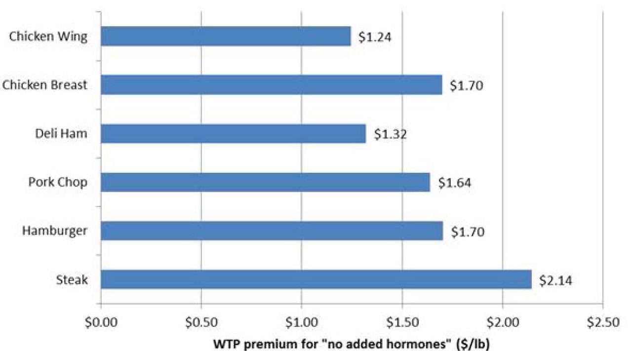
On average, respondents said they were willing to pay premiums between $1 and $2 for each of the meat cuts for ‘no added hormones.”  

The highest was for steak ($2.14/lb) and the lowest was for deli ham ($1.32). Of
course, paying a premium for chicken or pork labeled ‘no added hormone’ is superfluous because all pork and chicken production avoids the use of added growth hormones.

False beliefs tend to inflate WTP for ‘no hormone added’ labels. People’s beliefs about hormone use are correlated with their willingness to pay a premium for ‘no added hormone.’ For example, a person who thinks no hormones are used in pork is predicted to pay a premium of $1.44 for pork chops with a ‘no added hormone’ label, whereas a person who thinks 100% of pigs are given hormones is predicted to pay a premium of $1.81. For chicken breast, the same figures are $1.42 and $1.92.

All this perhaps explains why many pork and poultry producers add the claim "no added hormones" to the label.  These labels, however, while truthful, might also be misleading. Because, as our survey shows, people think there are high levels of hormone use in pork and poultry production.  

Restaurant Performance Index

I was recently made aware of the so-called Restaurant Performance Index (RPI) put out by the National Restaurant Association (NRA).  According to their website: 

The RPI is based on the responses to the National Restaurant Association’s Restaurant Industry Tracking Survey, which is fielded monthly among more than 400 restaurant operators nationwide on a variety of indicators including sales, traffic, labor and capital expenditures. Restaurant operators interested in participating in the tracking survey

and

Index values above 100 indicate that key industry indicators are in a period of expansion, while index values below 100 represent a period of contraction for key industry indicators. The Index consists of two components – the Current Situation Index, which measures current trends in four industry indicators (same-store sales, traffic, labor and capital expenditures), and the Expectations Index, which measures restaurant operators’ six-month outlook for four industry indicators (same-store sales, employees, capital expenditures and business conditions).

I was a bit curious. How well do some of the variables I'm tracking in my Food Demand Survey (FooDS) follow the NRA's RPI?  By looking back at past releases, I was able pull together  monthly data on the overall RPI, the current situation index, and the expectations index, and I merged these with data from FooDS on average reported spending on food away from home and changes in anticipated spending on food away from home each month.  

First, the good news.  Spending on food away from home (as measured by FooDS) seems to track closely with the RPI-current situation index.  

It probably isn't too surprising that the two are positive correlated since two of the measures of the RPI-current situation index are same store sales and traffic volume; however, it is still comforting to see my FooDS data roughly track this measure from the NRI.  One benefit of FooDS is that we release the data in a more timely manner.  Right now, the latest figures available from the National Restaurant Association (NRA) are for March.  However, I already have a measure of April's away from home food expenditures from FooDS (it's $55.43).  A simple linear regression predicts that NRA's current situation index will be 102.3 for April.  We're already fielding May's FooDS right now, so I can make an even more up-to-date forecast in a few days.

Now, the not-so-good news.  In FooDS, we track consumers' stated intentions to increase or decrease spending on food away from home in the following weeks.  One "anomaly" present in the FooDS data is that, every month, people say they plan to spend less on food away from home next month.  Over the three years we've been doing FooDS, the measure ranges from a -2.4% cutback in spending to a -1.05% cutback in spending (average is -1.59%).  I interpret this as people feeling guilty about spending on food away from home, and perhaps even evidence of a self-control problem: people plan to cut back on eating out but rarely actually do.  In any event, despite this "bias", trends in this variable might still be useful as there are some months people plan to cut back more than others.  

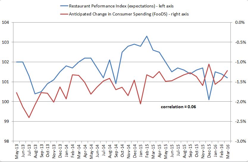
Here's a plot of the planned spending change on food away from home from FooDS alongside the expectations portion of the NRA's Restaurant Performance Index:  

While the correlation between the two is positive, it is pretty weak.  The two track each other pretty closely through about mid 2014 and then start moving in opposite directions.  The two measures are getting at slightly different things.  One is measuring how restaurant owners/managers are planning to change capital expenditures, staffing, and what they think sales will be in the future; the other is a measure of how much consumers think they'll change spending.  Maybe all this says is that restaurant operators' expectations are not the same as restaurant consumers' expectations.  

So, here's a little test.  How well do restaurant owner's expectations this month correlate with their own "acutal" (or current performance index) the following month?  The correlation between the lagged NRA expectation index and the current period NRA current situation index is 0.35.  O.k., so there is some accuracy associated with the NRA's expectation index.

Now, let's do the same thing with the FooDS data.  How well do consumers' expected spending changes this month correlate with their own "acutal" food away from spending next month? The correlation between the two is 0.68.  So, despite the fact consumers' expectations are downwardly biased as discussed above, changes in their expectations seem quite predictive of next month's spending on food away from home.    

So, it seems consumers (in aggregate) know their own futures a bit better than restaurant operators know theirs.