Blog

Food Demand Survey (FooDS) - September 2016

The latest results of the Food Demand Survey (FooDS) are now out.  A few results of note:

  • Willingness-to-pay (WTP) for beef products was essentially unchanged compared to last month, and there were small movements in pork and chicken WTP.
  • Spending on food away from home increased about 8.7% from August to September.
  • Compared to last month, there was an uptick in awareness and concern for bird flu.  Pink slime was less in the news and of less concern compared to September.  Both awareness and concern for GMOs fell relative to last month.  
  • Respondents reported being less concerned about losing weight this month compared to last.  

We asked a few ad hoc questions, but these will be discussed at a later date as analysis is still underway.  

What do meat eaters and vegetarians spend on food?

Bailey Norwood and I have a new paper forthcoming in the journal Ecological Economics that seeks to identify how much money vegetarians spend on food relative to meat eaters.  This issue is of interest because food costs are often a reason touted for reduced meat consumption.  The argument is that meat is expensive and thus eschewing meat (or participating in meatless Monday, for example) will save you money.  Here additional motivation for the work:

The implications of the dietary costs of vegetarians goes beyond the impacts on one’s wallet—it will help determine the carbon footprint of meat, dairy, and eggs. If a vegetarian spends less on food, what do they do with their remaining income? And do those other purchases have higher or lower carbon impacts? If vegetarian diets have both a lower carbon footprint and a lower price-tag, then one cannot really determine the carbon impact of becoming a vegetarian without accounting for how those food savings are spent. If vegetarians spend 15% less on food but use those savings on a plane flight, then their overall carbon footprint might rise. Indeed, Grabs (2015), who labels this a “rebound effect”, found that half of the carbon footprint reduction attributable to a vegetarian diet actually disappeared after accounting for the carbon effects of the remaining expenditures. Like Berners-Lee, Grabs infers the expenditure patterns of vegetarians using an amalgamated dataset using inferred (rather than observed) prices paid by each individual, where US data on the differences between the diets of vegetarians and omnivores based on Haddad and Tanzman (2003) is assumed to hold true for Swedish citizens.

Even if the cost of food isn’t a prime reason typically given to adopt vegetarianism, environmental impacts are, and what Grabs shows is that the two items are related. A better understanding on the relationship between vegetarian diets and food expenditures is thus warranted not just because it helps us understand the monetary consequences of altering our diets, but the environmental consequences as well.

We used data from my monthly Food Demand Survey (FooDS) to determine how much vegetarians report spending on food at home and away from home compared to meat eaters. The analysis is complicated by several factors.  First, many of the people in our survey who say they are vegetarian or vegan actually choose a meat item in a prior portion of the survey that simulates a shopping experience (perhaps because someone else in their household eats meat).  Thus, we conduct our analysis separately for "true" vegetarians (about 2.2% of the sample) and "partial" vegetarians (about 3% of our sample).  Secondly, vegetarians/vegans differ from meat eaters in a variety of ways, such as gender, political ideology, income, etc.  This raises the question of whether differences in gender, income, etc. explain differences in spending patterns or whether it is dietary choices.  Moreover, while one can change from from a meat eater to vegetarian, one cannot (easily) change from male to female, very conservative to very liberal, or black to white.  Thus, we conduct several counter-factual simulations where we ask what happens if one converts to vegetarianism but retains their prior demographic characteristics vs. someone who differs in both regards.  

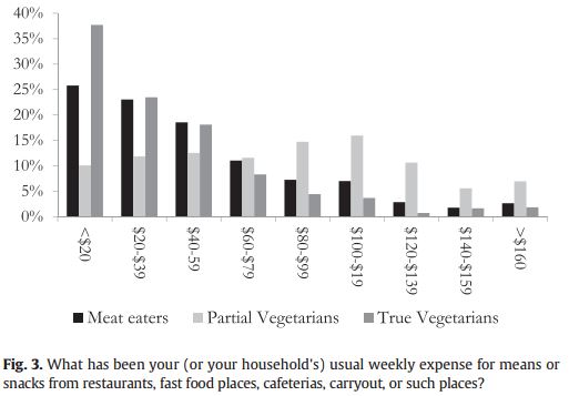
Here are some summary statistics on distribution of spending by meat eating status (not controlling for demographic or income differences)

It appears "partial vegetarians" spend more on food than the other two groups, however, when one looks at the demographics this group is also a bit richer, is more likely to have children in the household, and has larger household size - all things that are correlated with higher food expenditures.  

After adjusting for differences in demographics, we continue to find differences in spending patterns, though the differences are typically smaller.  Here are some graphs I constructed using the estimates in the paper. The figure shows spending for each consumption group assuming each group has demographics equal to the mean demographics in the sample (i.e., each group has the same demographics) for different levels of income.  

In general, richer households spend more on food than poor households regardless of whether one eats meat or not.  However, at every income level, partial vegetarians spend more than meat eaters while true vegetarians spend less (assuming same gender, household size, etc.).  For example, for households earning between $60,000 and $79,000 per year, weekly spending on food for meat eaters is $156, for partial vegetarians its $196, and for true vegetarians its $116.

Here is the same result expressed as a share of income (these are the so-called Engel curves).

Meat eaters in households earning between $60,000 and $79,000 per year spend about 11.6% of their income on food for partial vegetarians at the same income level it's 14.5%, and for true vegetarians it 8.5%.

Of course, these three groups don't have the same incomes.  The percent of respondents living in households making more than $100,000/year is 11.3% for meat eaters, 18.3% for partial vegetarians, and 14.4% for true vegetarians.  Thus, if one adjusts for differences in household income, some of the differences shown in the above graphs disappear.

Here is a summary of what we found.

To the extent that self-reported food expenditures are reliably correlated with actual expenditures, true vegetarians spend less money on food than meat eaters and partial vegetarians spend more. Although this result might be used to suggest that meat eaters could replace their meat with vegetables and save around $20 per week in food, this is deceiving. Roughly half of these savings are not due to the change in types of food purchased, but demographic differences. There are certain demographics that one can change in an effort to better mimic true vegetarians. Two of these are body mass index and political attitudes, but although they can be modified by the individual, their impact on food expenditures is small if not zero. The demographic traits that help true vegetarians save money must then reside with more fixed factors like household size, gender, and the like.

Food Demand Survey (FooDS) - August 2016

The August 2016 edition of the Food Demand Survey (FooDS) is now out.

A few if the items from the regular tracking portion of the survey:

  • After a spike up last month, willingness-to-pay (WTP) for steak fell 12%.  WTP for other meat products remained relatively steady compared to last month.
  • Awareness in the news of all items we track (but one) increased in August compared to July, and the largest percent increases in concern were cloning and hormones.
  • Consumers anticipate lower prices for beef and indicate they plan to eat more beef and chicken this month compared to last.
  • Consumer are spending slightly more at home and less away from home on food this month compared to last.

Three new ad hoc questions were added this month.

I was recently made aware of some programs being pursued by food and agricultural organizations to add labels to food advertising, for lack of a better phrase, social causes.  So, I was curious what consumers thought of these sorts of programs.

First, participants were asked: “Imagine seeing a label on a food product that pledges a portion of the proceeds from the sale of the food go to a particular social cause or group.  Which of the following social causes or groups would be most appealing to you?  Participants were asked to rank each of the outcomes on a scale of 5 to 1 where 5=most appealing and 1=least appealing. 

On average, participants ranked a label pledging a “portion of the proceeds go to a local food bank to help the hungry” as the most appealing.  Participants ranked a label pledging a “portion of the proceeds go to a campaign to promote healthy eating and exercise” as the least appealing.   The following figure shows the percent of respondents who ranked each issues as most appealing: More than half the participants ranked "Portion of the proceeds go to a local food bank to help the hungry" as most appealing.  

Second, participants were asked “Which of the following characteristics would be most important to you when shopping for eggs? Please allocate 100 points to the following characteristics in terms of the importance in deciding whether and which egg option to buy (total points must sum to 100).”

Six different characteristics were shown in random order. 

On average, “Price: low vs. high price” was most important when shopping for eggs, with 26 out of 100 points allocated to this issue on average across participants. The brand of eggs was rated as least important with less than half the points allocated to brand than price.  Size was, on average rated slightly more important than cage vs. cage free, whereas color was slightly less important than this issue.  

These statistics can provide a crude estimate of willingness-to-pap (WTP).  Presuming respondents perceive that the gap between low vs. high prices is a $1/dozen difference, then for every dollar change, mean rating falls by 26 points.  By contrast, going from small to large eggs increases the mean rating by about 20 points.  It follows that people would give up 20/26=$0.77/dozen to have large instead of small eggs.  Using similar logic, WTP for cage free vs. cage is $0.67/dozen, brown vs. white is $0.48/dozen, proceeds to preferred social cause vs. none is $0.46/dozen, and least to most preferred brand is $0.46/dozen. 

Presuming respondents perceive that the gap between low vs. high prices is a $2/dozen difference, then for every dollar change, mean rating falls by 26/2 = 13 points. And, in this scenario, WTP for large vs. small eggs is 20/13 = $1.55/dozen.  WTP for the other attributes also double under these assumptions.

Lastly, I added the question, "Are you a member of the AmeriCorps program?"  This question was added in response to a suggestion I received at the end of my AAEA presidential address.  As I discussed a few days ago, one of the points of discussion in my talk related to predicting vegetarian status.  I mentioned how vegetarians/vegans tend to be young, female, liberal, and paradoxically somewhat high income and on food stamps.  After my talk a young women approached me and asked whether I knew if my participants were a part of the AmeriCorps program.  I said "no" - why?  She remarked that the characteristics I just described fit the people she knew who were AmeriCorp members.  I honestly don't know much about the program, but according to my questioner many of the members are young, recent college grads who tend to be liberal and who are often from relatively well-off families but who are encouraged by people in the program to sign up for SNAP (aka "food stamps").  

What did I find in this most recent survey?  Overall, 7.65% of the respondents said they were members of AmeriCorps.  And, overall, 5.6% of respondents said they were vegetarian or vegan.  So, how did my young questioner's hypothesis hold up?  Amazingly well!  Of the people who said they were a member of AmeriCorps, a whopping 40% said they were vegetarian or vegan!  By contrast, only 2.7% of non-AmeriCorps members said they were vegetarian or vegan.  Stated differently, of all the vegetarian/vegans in our sample, over 55% of them were a member of AmeriCorps.  

Consumer Research and Big Data

Its been a great week in Boston at the Agricultural and Applied Economics Association (AAEA) annual meeting.  It's always good to see old friends, meet new ones, and learn about a wide array of topics.  

This year, I had the privileged of taking over as president and giving the AAEA presidential address.  I chose to talk about new and emerging data sets that are being used in consumer research.  I presented several short studies using data from the Food Demand Survey (FooDS) to illustrate how we might garner new insights about consumer heterogeneity and demand using new datasets.  A working draft of the paper is here. [Note: I've updated the paper (new draft here) in response to some comments, and some of the elasticity figures have change because I found a small error in my code)   I welcome any comments.   

A few key lessons.  First, there are big differences across consumers in their demands for food at home and away from home, but larger datasets that have a lot of cross-sectional and temporal variability reveals that the "representative consumer" hypothesis is probably false.  Here's a plot showing the distribution of the income elasticitities of demand for food at home and away from how (i.e., how much additional food at home or away from home a household buys as their income increases). For some households, food at home is a "normal" good (they buy more when they make more), but for other households, food is an "inferior" good (they buy less when they make more).  Food away from home is a normal good for more households than is food at home.

One of the main ways economists have studied consumer heterogeneity is by doing surveys.  However, almost all these surveys are conducted at a single point in time.  Thus, they present a "snap shot" of consumer preferences.  Using my survey data, however, I showed (using a so-called choice experiment repeated monthly) that these typical survey approaches might miss a lot of variability over time.   

Finally, one of the problems with many consumer research data sets is that they are not large enough to allow us to learn much about small segments of the population.  If one wants to learn about people with Celiac disease, for example, then a survey of a random sample of 1,000 people will only turn up roughly 20 people with the disease - hardly enough to say anything meaningful.  

In FooDS, we've been asking whether people are vegetarians or vegans for over three years now.  This group only represents about 5% of the population, so one needs a large data set to describe the characteristics of this group.  I used a machine learning method (a classification tree) to predict whether a person self-identified as vegetarian or vegan.  Here's what turned up.  Vegetarians tend to be very liberal, on SNAP (aka "food stamps"), with relatively high incomes, and children under 12 in the house.  

These are just a few examples of the growing number of questions economists can now start to answer as we get our hands on larger, richer datasets.  

Food Demand Survey (FooDS) - July 2016

The July 2016 edition of the Food Demand Survey (FooDS) is now out.  

Results reveal a reversal in the three-month slide in demand for meat products.   Willingness-to-pay (WTP) increased for all food products in July; there were sizeable increases in WTP for steak WTP (+46.44%) and deli ham (+33.15%) from June to July. This month, WTP for steak reached its highest point since FooDS began in May 2013. Compared to one year ago (July 2015), WTP is higher for all food products. 

Results also suggest an increase in spending at food away from home. Compared to June expenditures on food away from home were up 6.3% and there was a near doubling in plans to eat out more in July compared to June.  

Another major development was that this was the first time that farm animal welfare ranked in the top three issues of concern (behind E. Coli and Salmonella) since the beginning of FooDS.  

This month three new ad-hoc questions were added.  

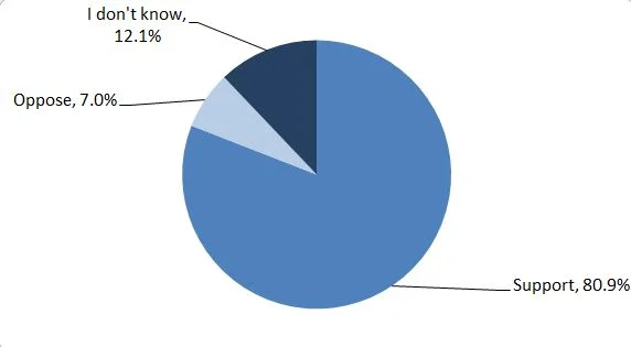
The first dealt with the new GMO labeling bill I mentioned a couple days ago, which has been passed by the Senate and currently being considered by the House.   Participants were asked: “The US Congress is considering a bill that would require food companies to disclose whether a food contains genetically engineered ingredients. Food companies can comply by placing
text on packaging, provide a QR (Quick Response) code, or by directing consumers to a phone number or website. Do you support or oppose this legislation?”.

Approximately 81% of respondents stated they would support the bill, 7% said they would oppose the bill, and just over 12% of respondents stated “I don’t know”. 

At this point, we should all know these sorts of questions can be a bit misleading as consumers have very little information about the issue and can be shown to support other absurd policies like DNA labeling.  However, I'd read these results to suggest that mandatory GMO labels that include disclosure via QR codes do not substantively decrease consumer support for the policy.  

Second, participants were asked “Where do you tend to receive the most helpful and accurate information about food health and safety issues? (pick one issue)” Then 14 different sources were listed.

Local television news was listed most frequently as the most helpful and accurate information source (17%), while 11.7% of respondents said evening or nightly television news shows were the most helpful. Only 2.54% of participants listed books are their most helpful source of information. 5.37% of participants stated “other” as their most helpful source of information. Those who selected “other” gave examples including “NatrualNews.com”, “my own online research”, “Institute of Food Technologists mailing list”, “local highly educated farmer”, and “internet”.

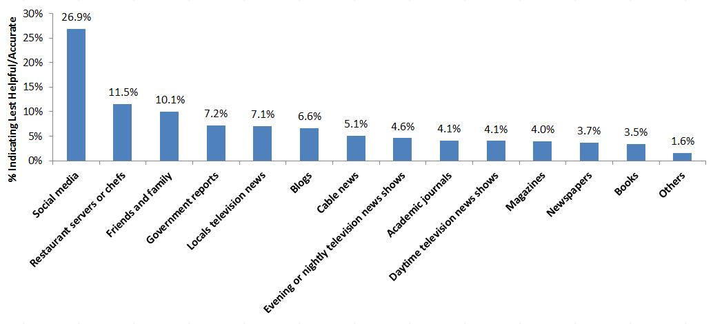
Last, respondents were asked: “Where do you tend to receive the least helpful and inaccurate information about food health and safety issues? (pick one)” The same 14 sources were listed as in the previous question.

By far, social media was the most frequently listed least helpful and inaccurate source of information about food health and safety issues at 27%. 11.5% of participants stated that restaurant servers or chefs were the least helpful and inaccurate source of information. Friends and family was ranked third, with 10.1% of participants. 1.6% of participants selected “other” as their least helpful and inaccurate source of information. Those who stated other, listed examples including “internet news”, “nurses”, “family who think they know”, “Youtube”, and “Packaging”. 

To further flesh out the results, the following chart plots the sources according to the percent of respondents indicating the source as most accurate vs. the percent indicating the source as least accurate. Sources on the bottom right of the figure would be more universally seen as most helpful land accurate, where as those on the top left of the figure would be just the opposite.

Restaurant chefs and servers are among least helpful/accurate with local television
news being among the most helpful/accurate. Friends and family are the most polarized group, with roughly equal numbers of consumers listing the source as most accurate and least accurate.