Blog

Food Values of the Rich and Poor

As I've discussed in the past, I've been measuring consumers "food values" in the monthly Food Demand Survey (FooDS) for the past four years.  The way this works is that a list of 12 items is presented to respondents and they are asked which are most and which are least important when buying food.  Respondents have to click and drag four of the items into a "most important" box and also put four in a "least important" box, leaving four in neither box (for exact question wording see page 7 of this document).  

The advantage of this questioning approach is that it requires a tradeoff - respondents can't say all issues are important and they have to indicate some food values as least important.  To create a scale of importance, I simply calculate the percent of times an issue is placed in the most important box and subtract it from the percent of times it is in the least important box, creating a measure that ranges from 100% to -100%.  

Month in and month out, we consistently find that taste, safety, nutrition, and price are the four most important food values and environment, origin, fairness, and especially novelty are the least important.  Issues like appearance, naturalness, animal welfare, and convenience fall in the middle.  

While the above rankings of values are true on average, it is useful to ask: how do food values differ across consumers with different incomes?  This question is important because not all consumers have the same preferences, and the people with the ability and connections to affect public policy (and grocery store bottom lines) may give priority to food issues that are less relevant to people in the lower end of the socioeconomic spectrum.  

To address this issue, I used some statistical analysis to control for differences in age, gender, education, etc. and then compare how people in different income categories rate each food value.  For ease of comparison, I always set the food value of people lowest income category (less than $20,000 in annual household income) at zero and compare how much higher or lower (again on the -100% to +100% scale) people in other income categories are relative to consumers in the lowest category.    
 

Food Values Relatively More Important to the Poor than the Rich

There were three food values for which importance tended to decline with income: price, safety, and taste.  The big one is price.

foodvalue6.JPG

Compared to consumers in the highest income category (more than $160,000/year in household income), consumers in the lowest income category (less than $20,000/year in household income) place 42 percentage points higher level of importance on the price they pay for food.  Recall that the scale only spans from +100 to -100, and as such, this is a huge difference in the importance of price.  The implication is that policies and actions that adversely affect food prices will matter much more to lower than higher income consumers.  This isn't necessarily surprising, but as the above graph shows, the difference in magnitudes is remarkable. 

Lower income consumers also place relatively more importance on food safety than higher income consumers as indicated in the graph below, however the differences aren't as pronounced as that for price.  Note that this doesn't mean high income consumers don't care about food safety per se, only that safety is less important than other food values to the rich compared to the poor.

foodvalue8.JPG

Lower income consumers also tend to place a lower relative value on taste than higher income consumers, however, the differences aren't particularly pronounced (at most a 7 percentage point spread between high and low income).


Food Values Relatively More Important to the Rich than the Poor

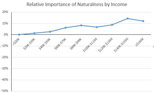
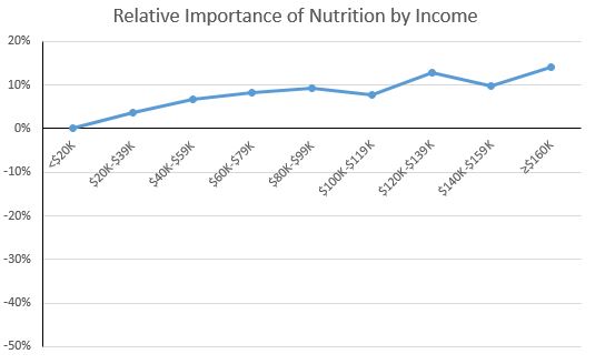
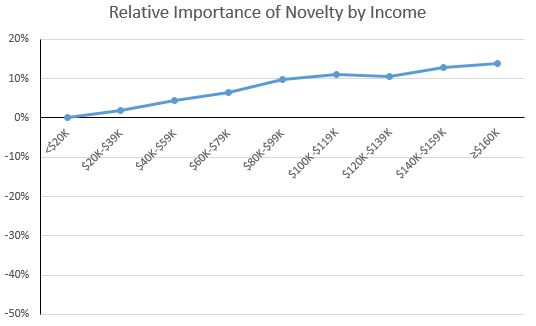
There were five food values for which importance tended to increase with income: naturalness, nutrition, environment, novelty, and origin.

foodvalue1.JPG

As the figure above shows, the highest income consumers placed about 12-14 percentage points higher importance on naturalness than lower income consumers; for nutrition and environment (see below), the results are similar.  

foodvalue2.JPG
foodvalue3.JPG

The environment result is somewhat relevant to debates about the environmental Kuznets curve, which posits that as a country's income increases from a low to mid level, the environment degrades, but then as income increases from a mid to higher level, the environment improves.  One reason cited for the later results is that as people become wealthier, they care more about environmental amenities.  The above graph suggests this is true for the environmental impacts of food production as well.

The figure below also shows that higher income households place a higher relative value on the novelty of food than lower-income consumers.  This results is consistent with other research that suggests that lower-income households cannot afford to purchase novel or unfamiliar foods that other household members may not like and that might go uneaten.  That is, higher income households can afford the "risk" of trying new foods that may ultimately go to waste.

foodvalue4.JPG

Published papers

In a testament to the slowness of academic publishing in economics, I noticed two co-authored papers were just released that we've been working and waiting on quite literally for years.  

1) The Economic Journal finally released a paper I wrote with Laurent Muller, Anne Lacroix, and  Bernard Ruffieux.  I blogged on this paper about a year and a half ago when it was first accepted. In short, we find that "fat taxes" and "thin subsidies" are a double whammy on the poor because the price policies lead to i): the poor paying higher taxes owing to the fact they tend to eat more unhealthy foods than the rich, and ii) the poor receiving fewer subsidies owing to the fact they tend to eat fewer healthy foods than the rich.  These effects were exacerbated by the finding in that the poor tended to be more habit prone than the rich, sticking more to their now relatively more expensive diets. These findings have direct implications for the food movement policy proposals I discussed last week.   

2)  In early 2010, I was working with a bright young Master's student named Rock Andre.  Rock happened to be from Haiti, and when the earthquake hit his homeland, he decided to shift his research focus.  He returned home in the aftermath of the earthquake and surveyed over 1,000 people.  Development Policy Review just published that research.  Here's part of the abstract:   

The results indicate that almost two thirds of Haitians lost a friend to the earthquake, and nearly half lost a family member. People reported spending more on food in the aftermath of the earthquake, and the level of food aid received does not appear to have any impact on food expenditures. Among different types of aid, Haitians stated being most in need of a job—something difficult for international aid agencies to supply over the long run. They also indicated that quality of life would be most improved by education. The lessons learned in Haiti may prove useful in addressing future natural disasters.

Paarlberg on Farm Policy

Yesterday, I posted on a paper I wrote critiquing some of the proposals of the food movement.  As such, its probably only fair that I share a paper sent to me by a reader.  It was written by Don Paarlberg in 1987 and takes issue with farm policy from the Depression up to that date.  I found the history fascinating; the paper is short and well worth a read.  By the way, Don was a Professor of Agricultural Economics at Purdue and was a former Assistant Secretary of Agriculture.  

Here's an excerpt that shows some of the challenges with trying to manage agricultural prices and supplies.

Some of the antics of the commodity programs are so ludicrous as to be almost unbelievable. Dairy programs are perhaps the most fantastic. The government supported the prices of dairy products with the intention of increasing dairy farm incomes. But, as every student who has taken a beginner’s course in economics knows, the result was to stimulate production, reduce consumption, and accumulate a surplus. The surplus of butter, cheese, and dried milk was then donated to those on the welfare rolls. This proved to be an inadequate outlet so then these products were donated overseas. The surplus was still growing so the government bought and slaughtered whole herds of dairy cattle. Thereupon the beef cattle producers, who are self-reliant and are not shielded by price supports or production controls, complained of this subsidized competition with their product and the government responded by purchasing beef for donation to the school lunch program. This did not adequately alleviate the complaints of the beef producers so the government exported beef from the slaughtered dairy herds, a strange action indeed since we suffer from beef shortages and import substantial amounts. Our forced exports of dairy beef disturbed other beef exporters, making an additional problem for the GATT multinational trade negotiations in Geneva. All of these questionable strategies were undertaken because the government was unwilling to follow the most simple and effective expedient: lowering the official price.

Meanwhile, those dairymen who stayed in business currently anticipate a reduced supply of milk and a better market. They are increasing their herds and laying the basis for a larger supply of milk. Like the sorcerer’s apprentice, they have heard the signal for delivering more water (in this case, milk) and have heard no credible signal for stopping. The commodity programs create surplus. They make a burden of what should be a blessing—our capability to produce food.

Personal Choices to Reduce Greenhouse Gas Emissions

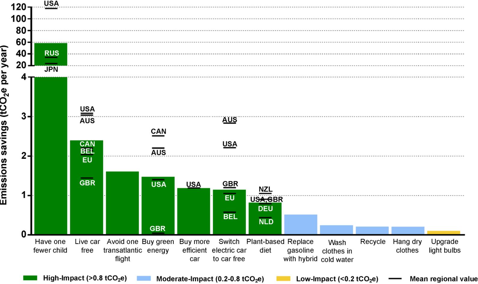
This article in Environmental Research Letters by Seth Wynes and Kimberly Nicholas calculates the ways various personal choices affect greenhouse gasses. The paper has received a lot of attention in the media (e.g., see here or here).   At the heart of the issue are the results from this figure in the original paper showing the relative effect of different actions on greenhouse gas emissions.


The findings led to headlines like this one in The Guardian, "Want to fight climate change? Have fewer children."  The findings are interesting on a number of fronts.  For example, I regularly see stories suggesting that the most impactful thing one can do to fight climate change is eat less meat.  That strategy shows up as a mere 7th on this chart, and way, way behind having children (not having a child has more than 60 times the emissions impact as moving to a more plant based diet).  

The implication that we should have fewer children raises a number of thorny issues that have long been debated.  Since at least Malthus, folks have been worried about a growing world population.  Stanford biologist Paul Ehrlich has raised alarm since the 1960s about the dire consequences of a "population bomb."  At the heart of this thinking is the premise that an extra person is a kind of threat: a threat to food security, a threat to the climate, a threat to the environment.  There's even a bit of a hint of this thinking in the common mantra of many agricultural organizations that we need to do what we can so that we can feed nine billion people by 2050.  The extra people that will arrive in the next 30 years or so are placing a burden on us today to increasing productivity.  

An alternative perspective, one often attributed to Julian Simon, is that an extra person is a blessing rather than a curse.  People aren't just consumers of resources but are are sources of ideas, creativity, and ultimately new resources.  An extra person isn't a threat but an opportunity.

Regardless of where one falls in this debate, it should be noted the above graph looks at just one side of the equation: the cost of an extra human in terms of extra greenhouse gasses.  What is ignored is the potential benefit of an extra human.  What is the opportunity cost of a foregone Einstein, Edison, or Jobs?  Going further, who are the folks most likely to heed the advice to forego children for the climate, and what would their would-be kids have been like?

It is also worthwhile mentioning that there is no guarantee that population will continue to grow, particularly if the world continues to develop and incomes rise.  Even the UN projections place some probability on a population decline in 30 years time.  One writer of Wired magazine, Kevin Kelly, when asked what we should be worried about (but presumable are not), fretted about about an underpopulation bomb.  Here's what he writes:

Here is the challenge: This is a world where every year there is a smaller audience than the year before, a smaller market for your goods or services, fewer workers to choose from, and a ballooning elder population that must be cared for. We’ve never seen this in modern times; our progress has always paralleled rising populations, bigger audiences, larger markets and bigger pools of workers. It’s hard to see how a declining yet aging population functions as an engine for increasing the standard of living every year. To do so would require a completely different economic system, one that we are not prepared for at all right now. The challenges of a peak human population are real, but we know what we have to do; the challenges of a dwindling human population tending toward zero in a developed world are scarier because we’ve never been there before. It’s something to worry about.

 A couple final thoughts.  The above graphs shows several possible mitigation options, but I haven't heard much discussion of tradeoffs.  Surely the end goal in life isn't to focus all our individual energies on activities to reduce carbon emissions.  So, given my preferences for driving, eating meat, or being a parent, the figures above suggest useful ways of thinking about this problem.  Maybe I don't want to have a more plant-based diet, but at least in terms of greenhouse gas impacts, I can "offset" that and more by foregoing my trip to Paris this year.  

More broadly, we don't normally worry about impacts of our various consumption choices on availability of other resources like steel or fertilizer or labor.  Why?  Because the market price for the goods should reflect the relative scarcity of these items.  One upside to a carbon tax is that we could forego all the moralizing and all these sorts of "consumption advice" types of papers and simply allow consumers to make choices they want given the relative prices of different goods.  But what about children?  The above graph would seem to justify a large carbon tax on having kids.  I'd guess that is a highly unpopular idea, which suggests to me that most of us are more likely to be in the Simon camp than the Ehrlich one when thinking about our own offspring.  

How Many Americans Go Hungry?

One of the most basic measures of well-being is whether people have enough food to eat. Whether the U.S. does well in this regard seems to depend on who you ask.  There are many people in the so-called food movement who seem to think we're doing ok on this front and that food is actually too cheap.  There are other groups like Feeding America that think hunger is a serious concern and are doing what they can to reduce it.

The USDA Economic Research Service produces the most widely used measure of hunger (or as they call it "food security").  According to their data

An estimated 12.7 percent of American households were food insecure at least some time during the year in 2015, meaning they lacked access to enough food for an active, healthy life for all household members. That is down from 14.0 percent in 2014.

This figure shot up during the great recession (reaching a high of 14.9% of households in 2011) but has subsequently fallen a bit as indicated above, but still remains higher than was the case prior to 2008 when it was regularly in the 10 to 11% range.  

I was curious how the sample of people I study every month in my Food Demand Survey (FooDS) matches up with these official government statistics.  In the most recent April 2017 edition of FooDS, we added some questions (the short 6-item measure) based on work by the USDA to measure food insecurity.  As an example, one of the questions is "'The food that I bought just didn’t last, and I didn’t have money to get more.' Was that often, sometimes, or never true for you/your household in the last 12 months?"

Data from FooDS reveals a strikingly high level of food insecurity - much higher than what the USDA reports.  According to the criteria outlined at the above link, we found a whopping 46.7% of respondents were classified as having low or very low food security (22.9% of the sample had low food security and 23.8% had very low food security).  

My first thought was that we must have made a mistake in how we asked the questions or in how we analyzed the data.  We ruled out those possibilities.  My second thought was that maybe my survey sample is really different from the U.S. population.  After all, who is willing to sign up to take online surveys?  Maybe people who really need the money and who are thus more likely to be food insecure.  But, this couldn't be the complete answer because I use weights to force my sample to match the U.S. population in terms of age, education, gender, and region of residence, and the average income of my sample isn't much different from the average income of the country as a whole.  Maybe the difference is that I used a 6-item measure of food insecurity rather than the full 18 items used by the USDA (but previous research has found strong agreement between the two).

When I mentioned this quandary to my friend Bailey Norwood, he knew immediately what was causing part of the the discrepancy, and I think it could have a big impact on how we fundamentally view the food security measures reported by the USDA.  

In short, the USDA assumes that if you make enough money you can't be food insecure [*Addendum, this original sentence, as stated, was too strong. As the quote below suggests, you can't be classified as food insecure if you're high income AND if you answer two preliminary questions on food insufficiency in particular way.  Some researchers in this area emailed me to note that about 25% of food insecure households have incomes at least 300% of the poverty line]. In their latest report, they indicate in footnote 5: 

To reduce the burden on higher income respondents, households with incomes above 185 percent of the Federal poverty line that give no indication of food-access problems on either of two preliminary screening questions are deemed to be food secure and are not asked the questions in the food security assessment series.

What if I take my FooDS data and just assume anyone that has an income that puts them at 185% of the poverty line (based on these criteria) is food secure despite the answers they gave on the survey? (note: my calculations are crude because I only measure household income in wide $20,000 ranges and I simply assign people to the midpoint of the income range they selected).   

When I do this, I find that now "only" 22% are classified as having low or very low food security (9% of the sample had low food security and 13% had very low food security).  That's still a lot higher than what the USDA reports, so maybe my internet survey still has some sample selection issues.  However, it's still HALF the original measure.

What does this mean?  There are a lot of relatively high income people that would be classified as food insecure if the USDA simply asked them the same questions as everyone else.  There are a lot of relatively high income people that say "yes" to questions like "In the last 12 months, did you ever eat less than you felt you should because there wasn't enough money for food?"  

None of this to say that income isn't a determinant of food security, but that it shouldn't be the only signal, particularly if someone is in a lot of debt or if they have large households, they could still be going hungry.

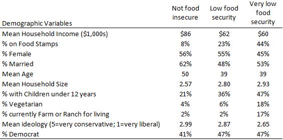
In any event, here are some of the demographic characteristics of the people who, according to my sample (and without making the above discussed income correction), classify as being food secure, low food security, or very low food security.  

As the above table indicates, income matters as the average income of food secure households is $86,000/year.  However, households with low food security still average $60,000/year, which is far above 185% of the poverty level for most households.

Households that classify as very low food security are much more likely to be on SNAP (aka food stamps).  Of course, this isn't causal: being on SNAP isn't causing food insecurity but likely the other way around.  Two other noteworthy results.  Households classified as having very low food security are much more likely to 1) have children in the household and 2) report farming or ranching as a primary occupation.