Blog

Unscrambling COVID-19 Food Supply Chains

That is the tile of a new paper with Trey Malone and Aleks Schaefer, both at Michigan State University. Here is the abstract:

This article uses evidence from the egg industry to investigate how the shift from food-away-from-home and towards food-at-home affected the U.S. food supply chain. We find that the onset of the COVID-19 pandemic increased retail and farm-gate prices for table eggs by approximately 141% and 182%, respectively. In contrast, prices for breaking stock eggs-which are primarily used in foodservice and restaurants-fell by 67%. On April 3, 2020, the FDA responded by issuing temporary exemptions from certain food safety standards for breaking stock egg producers seeking to sell into the retail table egg market. We find that this regulatory change rapidly pushed retail, farm-gate, and breaking stock prices towards their long-run pre-pandemic equilibrium dynamics. The pandemic reduced premiums for credence attributes, including cage-free, vegetarian-fed, and organic eggs, by as much as 34%. These premiums did not fully recover following the return to more “normal” price dynamics, possibly signaling that willingness-to-pay for animal welfare and environmental sustainability have fallen as consumers seek to meet basic needs during the pandemic. Finally, in spite of widespread claims of price gouging, we do not find that the pandemic (or the subsequent FDA regulatory changes) had a meaningful impact on the marketing margin for table eggs sold at grocery stores.

We tried to tease out the effect of the pandemic itself on egg prices from the impact of FDA rules that barred eggs from easily moving from the restaurant to the grocery market. Here’s what we find on that latter point.

These results suggest that had the FDA not suspended Egg Safety Rules for breaker producers seeking to sell into the table eggs market - farm-gate and retail table egg prices would have been approximately 53% and 56% higher than those observed in the last week of May. On the other hand, breaking prices in the same week would have been about 50% lower.

The key results as they related to impacts on commodity egg prices are shown in the following graphs (the dashed lines are our forecasts of what would have happened had COVID19 not occurred).

eggpriceimpacts.JPG

You can read the whole paper here.
These 15 Plants Slaughter 59% of All Hogs in the US

Headlines have started to appear indicating the shutdown of meat packing plants around the country as a result of COVID-19.

So, just how concentrated is meat processing and how impactful might a plant closure be? As it turns out, the National Pork Board puts out information on processing capacity. According to their data, the U.S. has the capacity to slaughter 506,470 pigs per day. Almost 60% of this capacity comes from just 15 plants.

porkprocessingcapacity.JPG

These plants are heavily concentrated around Iowa.

porkprocessingmap.JPG

Given the size relative to the industry, the closure of any of these plants has the potential to reduce hog prices and increase wholesale and retail pork prices (the economics are explained here). Glynn Tonsor and Lee Schultz’s recent analysis by suggests every 1% reduction in pork processing capacity is associated with a 1.82% reduction in hog prices. Hog prices have already been tumbling over the past couple weeks, potentially reflecting the market’s expectation of some capacity being brought off-line.

Meat and Egg Prices Following the COVID-19 Outbreak

The declaration of a national emergency on March 13, 2020 by President Donald Trump, and the corresponding state stay-at-home measures, caused significant disruptions in retail food markets.  Aside from take-out, many consumers were suddenly unable to dine at restaurants and food service establishments away from home, which according to U.S. Department of Agriculture data, represents about 54% of all food expenditures.  As a result, consumers turned to grocery stores and supermarkets, where the increase in demand, coupled with concerns about future reduced mobility and scarcity, led to a surge in foot traffic and sales. 

              For the week ending March 22, 2020, the number of trips to grocery stores and supermarkets increased 39%, and during each trip, consumers purchased about 12% more items, and spent, in aggregate, about 61% more as compared to the same week one year prior.  Fresh meat and frozen food sales led the increase in dollar sales.  Pork sales increased 101%, beef sales increased 95%, and chicken sales increased 70% for the week ending March 22, 2020 as compared to the same time period in 2019. 

meatsales_covid19_new.JPG

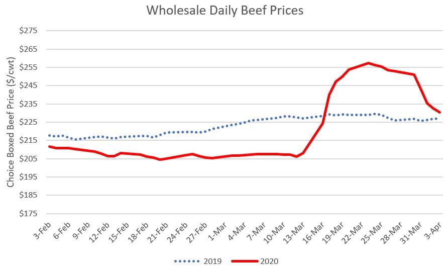
      Increasing food prices suggest the increased demand in grocery establishments appears to have more than compensated for the lost demand at restaurants, at least in the short run.  The figures below report U.S. Department of Agriculture data made available by the Livestock Marketing Information Center on wholesale prices of pork, beef, chicken, eggs.  In each of these cases. wholesale prices began dramatically rising at about the time President Trump declared the national emergency.  For example, wholesale pork prices jumped almost $20/cwt from about $65/cwt in early March to just under $85/cwt by mid-March.  For beef, wholesale boxed beef prices increased about $50/cwt, going from about $205/cwt to over $255/cwt.  Wholesale chicken prices increased a bit over $10/cwt over this same time period.  However, as the figures reveal, the price pressure has already started to subside for beef, pork, and chicken.  In fact, for pork and chicken, price levels are near or below what was experienced at the same time last year. 

wholesale_beef_price.JPG
wholesale_pork_price.JPG
wholesale_chicken_price.JPG

The case of eggs reveals a different story.  Wholesale egg prices were about $1/dozen in early to mid-March 2020, approximately in line with prices at the same time in 2019; however, prices have nearly tripled since that time, and by the week ending April 4, 2020, prices were $3/dozen, with the increase showing no sign of slowing yet.  A number of explanations have been offered for the price run-up in the egg market including consumer perceptions about the necessity of eggs and their longer shelf life relative to other animal proteins, dynamics associated with Easter egg buying, legal barriers that prohibited easy re-sale of eggs headed for restaurant markets to grocery, and the high degree of concentration in the egg production industry.

wholesale_egg_price.JPG

The increases in wholesale meat prices were not initially met with corresponding increases in farm-level hog and beef prices, causing consternation among some producers.  Going forward, increased concerns about illness spread in packing houses is likely to reduce processing capacity, further exasperating this problem, putting downward pressure on livestock prices.  A paper by Glynn Tonsor and Lee Schultz suggests a 20% reduction in processing capacity due to COVID-19 plant shutdowns could reduce cattle prices by 26% and hog prices by 36%. As they note, these effects may already be “baked in” to future’s prices. Moreover, coming into 2020, animal inventories were high, leading to large projected total meat and egg production for the year.  Temporary stocking-up behavior on the part of consumers buoyed demand in the short run following outbreak of COVID-19, providing a respite to the downward price pressure expected for 2020.   However, the loss of restaurant sales, coupled with reduced consumer incomes from a likely recession, and export markets for meat products being hard hit by COVID-19 suggest the general downward price movements witnessed in cattle and hog markets may continue even if wholesale prices rebound should processing capacity be adversely affected by disruptions associated with COVID-19.  

Who are you calling food insecure?

Every year, the USDA Economic Research Service (ERS) reports rates of food security in the United States. In 2018, 11.1% of U.S. households were estimated to be food insecure, down from a recent-history high of 14.9% in 2011.

These official statistics on food security are often interpreted in the media and by lay audiences as a measure of hunger. But, that’s not exactly what the USDA-ERS measures. A new paper by Sunjin Ahn, Travis Smith, and Bailey Norwood in Applied Economics Perspectives and Policy does a great job de-mystifying how official government measures of food insecurity are actually calculated. They also ably explain and articulate what other survey researchers must do to produce results that approximate the official measures.

Food insecurity is measured by the US Census Bureau asking a large sample of nationally-representative U.S. households a series of 10 questions (plus an additional 8 questions if there are children in the household) like how often, “In the last 12 months, were you ever hungry, but didn't eat, because you couldn't afford enough food?” or how often “I couldn’t afford to eat balanced meals.” A score is then calculated based on the frequency with which people respond affirmatively to the questions. If the score is high enough, the household is deemed food insecure. Seen in this way, food insecurity is probably best interpreted as a measure of a household’s perception of food affordability, although it almost surely positively correlated with hunger. The ERS has more information on how food security differs from hunger, and on the details of their measurement of food security here.

Ahn, Smith, and Norwood point out another issue that is not widely appreciated. They write:

To avoid overburdening respondents with unnecessary questions in the CPS‐FSS [Census Bureau Current Population Survey - Food Security Supplement] survey, surveyors first conduct a screening process. If a household’s income is greater than 185% of the poverty threshold, and they answer

(1) “no” to “… did you ever run short of money and try to make your food or your money go further,” or

(2) “enough of the kinds of food (I/we) want to eat” from the question “Which of these statements best describes the food eaten in your household …,”

they are assumed to be food secure and are not administered the Food Security questionnaire (ERS 2015b). This screening process varies: In a 2012 design description, the first of the above questions was not used (ERS 2012a), and documentation of the survey suggests sometimes the income threshold is 200% of the poverty threshold. Though it is recognized that some of the individuals screened out of the questions will in fact be food insecure, the screening was still seen as desirable because it reduces respondent burden (ERS 2015a). Thus, the CPS‐FSS food insecurity rates are a function of responses to food insecurity questions conditional on the statistical screening procedures employed.

Ahn, Smith, and Norwood’s paper is mainly framed around the question of whether opt-in, internet-based surveys can mimic the official government estimates of food insecurity. However, their results make abundantly clear the critical role of the income threshold in setting official food insecurity rates. In short, if we simply counted the scores on the food insecurity questions and ignored income, we would find MUCH higher rates of measured food insecurity. Before applying the income-cutoff, Ahn, Smith, and Norwood find food insecurity rates of 43% (in a 2016 survey) and 31% (in a 2017 survey). After applying the income cut-offs (essentially assuming anyone with an income over 180% of the poverty line can’t be food insecure) and some demographic weighting, the authors find opt-in internet surveys can produce estimates of food insecurity that are similar to that reported by the USDA-ERS.

I’m a little unsure of how to interpret these findings. On the one hand, I’m left with a sense that the official food insecurity statistics are heavily influenced by a somewhat arbitrary income cut-off, and that perhaps the official measure of food insecurity are too imprecise at measuring the construct we are really after. Another, reasonable, albeit alarming, conclusion is that there may a lot more food insecure people than we thought.

Measuring changes in supply versus changes in demand

I just finished up a new working paper with Glynn Tonsor that shows how to determine the extent to which a change in price (or quantity) results from a change in supply and/or demand. For some time, Glynn has been reporting updated retail demand indices for meat products. In this new paper, we show how to calculate an analogous supply index, which might provide a useful way to determine how much productivity is changing over time. The basic idea is that we want a way to separate changes in quantity demanded (or supplied) versus a shift in the demand curve (or the supply curve). We also show how the two indicies can be used to determine changes in consumer and producer economic well-being over time.

Here’s the motivation:

In 2015, per-capita beef consumption in the U.S. reached a record low of 54 lbs/person, falling almost 20% over the prior decade from 2005 to 2015 alone (USDA, Economic Research Service, 2020). Why? Some environmental, public health, and animal advocacy organizations heralded the decline as an indicator of their efforts to convince consumers to reduce their demand for beef; others argued, instead, the change was a result of supply-side factors such as drought and higher feed prices (e.g., Strom, 2017). Per-capita beef consumption subsequently rebounded, and in 2018 was almost 6% higher than in 2015. Dramatic fluctuations in corn, soybean, and wheat prices in the late 2000s through the mid-2010s led to similar heated debates about whether and to what extent price rises were due to demand (e.g., biofuel policy and rising incomes in China) or supply (e.g., drought in various regions of the world) factors (e.g., Abbot, Hurt, Tyner 2019; Carter, Rouser, and Smith, 2016; Hochman, Rajagopal, and Zilberman, 2010; Roberts and Schlenker, 2013). These cases highlight the challenge of interpreting market dynamics and the need for metrics that can decompose price or quantity changes to reveal underlying drivers and consequences.

We calculate the supply and demand indicies for a number of agricultural markets and time periods. First, consider changes in supply and demand in the fed cattle market since the 1950s, as shown in the figure below. The demand index trended positively from 1950 through the mid 1970s. The demand index peaked at a value of 204 in 1976, and it hasn’t been as high since. Demand fell through the 1980s and early 1990s before rebounding. Since 2010, the demand index has been at values just below the 1970’s peak. The supply index trend was positive from 1950 up till about 2000, but has been stagnant except for the past couple decades. Nonetheless, the 2018 supply index value is the highest of the entire time period since 1950. The figure shows a significant drop in the supply index that began in 2013 and bottomed out in 2015, which is likely a result of drought in the great plains and from high feed prices. The fact that the supply index dropped during this period while the demand index remained relatively flat helps provide insight into the debate discussed in the quote above.

fedcattlSDindex.JPG

One can also calculate changes in producer and consumer surplus over time. The following figure calculates the year-to-year changes. On average, from 1980 to 2018, producer surplus increased $2.7 billion each year and consumer surplus increased $0.58 billion each year. Despite these averages, there is a high degree of year-to-year variability. The largest annual change in producer surplus was $34 billion from 2015 to 2016; the largest decline in producer surplus was -$28 billion from 2013 to 2014.

fedcattlewelfare.JPG

Here’s how changes in the supply index compare for the three main meat categories. Chicken supply shifts have far outpaced that for hogs or cattle. The 2018 chicken supply index value is 380, meaning chicken supply is (380-100) = 280% higher than in 1980. By contrast, hog and beef supply are only 66% and 28% higher, respectively, than in 1980. These differences are likely explained by differential productivity patterns in these sectors. The rise in hog productivity since 2000 corresponds with a time period over which the industry became increasingly vertically integrated, increasingly mirroring the broiler chicken sector. The much longer biological production lags in beef cattle (which range from two to three years from the time a breeding decision is made until harvest) and less integrated nature of the beef cattle industry help explain the smaller increases in the supply index in this sector as compared to pork and chicken. We also show, in the paper, that these supply indicies correlate in intuitive ways with changes in factors like feed prices, drought, and aggregate U.S. agricultural total factor productivity.

meatsupplyindicies.JPG

One of the useful aspects of the supply and demand indicies is that they can be applied for highly disaggregated geographic units. To illustrate, we calculated U.S. county-level supply indicies. Here are the changes in U.S. supply indicies in the past couple years relative to 2000. Perhaps surprisingly, many areas of Ohio, Indiana, and southern Illinois have experienced negative corn supply shocks in 2016-2018 relative to 2000. The expanded geographical area of U.S. corn production (e.g more acres in the Dakotas) over this period helped mitigate national corn market effects of the adverse Eastern Cornbelt supply shocks. Note that corn yields and total production have increased significantly in many of the red counties over time, and this illustrates the importance of calculating a supply index rather than just looking at yield or production. The supply index gives us a feel for how much more (or less) is produced in 2018 relative to what we would have expected if the level of technology, weather, etc. were the same as in the year 2000.

cornsupplyindex.JPG

There is a lot more in the paper.