Blog

Some French Reflections

I was fortunate to spend the better part of 2011 on sabbatical in Paris working with the French National Institute for Agricultural Research (INRA) and the Organization for Economic Cooperation and Development (OECD). Stephan Marette from INRA was a fantastic host.

Although I have returned many times since then to attend conferences and serve on an INRA advisory board, last week was the first time I revisited the city and our old neighborhood with my family. Here are a few reflections on the trip that relate to some of the themes on this blog.

1) We spent one morning on a food tour with a French chef. He took us to some familiar spots and some new ones too. In the course of conversation, I mentioned that I’d worked some with INRA, and I found his reaction interesting. For context, INRA is a bit like the USDA Agricultural Research Service (ARS) and a bit like the USDA National Institute for Food and Agricultural Research (NIFA), except rather than indirectly funding university professors through state agricultural experiment stations (as NIFA does in the US), INRA directly employs many PhD scientists who are housed at universities in addition to scientists at their own facilities. In any event, my guess is that if you mentioned ARS or NIFA to a chef in, say, New York, Chicago, or LA, they’d have no idea what you were talking about. ARS or NIFA who? But our French chef knew exactly who INRA was - and apparently he wasn’t much of a fan. He said that INRA only cares about producing more quantity and didn’t care about food quality, the later of which he argued was of greater importance to French consumers. I don’t think that characterization is exactly true (INRA does a lot of research on diets, health, food quality, and sustainability), but his perception of their objectives and purpose is nonetheless interesting and not entirely inaccurate. To the extent American consumers and taste-makers are familiar with US agricultural research agencies and universities, I wonder if they’d say the same? The research is clear that agricultural research produces significant benefits, but it is also true that future funding for agricultural research will depend, in part, on public support. That’s why we have to continue to find new ways to articulate the value of productivity enhancing research (for example, focusing on sustainability) and highlight the agricultural research that improves the both the price and the quality of food for consumers.

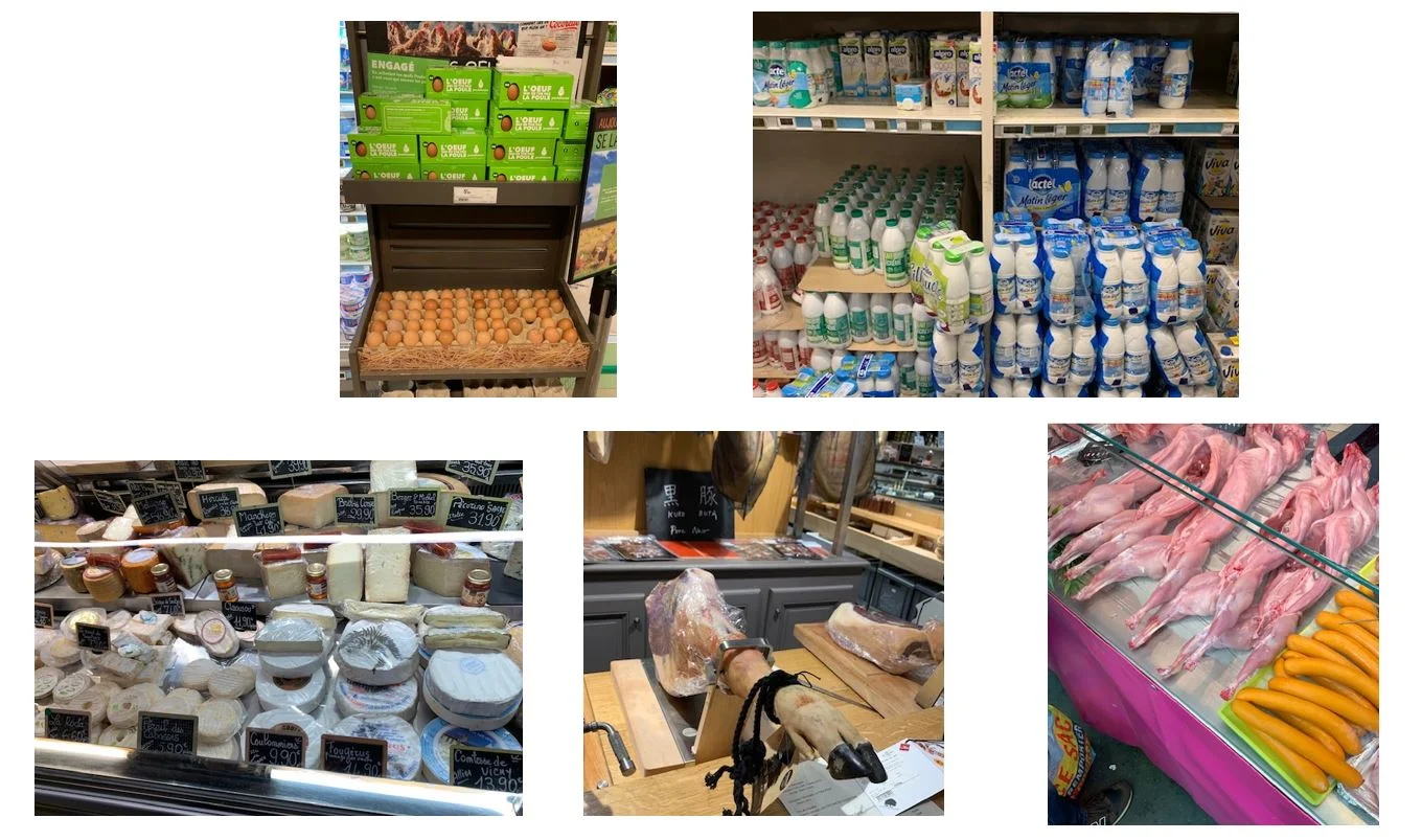
2) Given French consumer’s aversion to GMOs, attempts to ban glyphosate, and more, one might be tempted to argue that the French are more fearful of food safety risks. But, that can’t be exactly true. Below are a few pictures I snapped on the recent trip. These are not out of the ordinary in any way, but items one can find on the streets or usual supermarkets in Paris. What foods are available? Unrefrigerated eggs, unrefrigerated milk (it’s ultra high temperature pasteurized) sitting out next to the laundry detergent, cheeses from unpasteurized milk, hog legs (with hoof intact), raw rabbit carcasses for sell by street vendors, and much more. Many Americans I suspect would be very fearful of these common French foods. The French seem more accepting of “natural” food risks and less accepting of “modern/technological” food risks relative to Americans, although the example of the ultra-high pasteurized milks runs counter to that theme.

parispics.JPG

3. The French seem acutely interested in the origin/provenance of food and they often seem to use this attribute as a proxy for quality in the same way many Americans use brands. One of my current PhD students, Kendra Rash, is presenting some research at the upcoming meeting of the Agricultural and Applied Economics Association. We are analyzing some data from an experiment conducted by Laurent Muller and Bernard Ruffieux with French consumers related to the value of different types of information. We found that information on origin is more highly valued than information on brand, price, organic, and more. I was a bit skeptical of this finding (mainly because other research I’ve done in the US shows origin to be a relatively unimportant food value), but my resent visit was reassuring and suggests our French findings are probably right. A good example is wine. In the US, we normally shop for wine by grape variety (Cabernet, Merlot, or Pinot Noir), but in France, wine is typically advertised by location and vineyard (and one is supposed to know which types of grapes are grown there).

4. Despite the differences, I’ll point to one of my favorite papers by by Pierre Dubois, Rachel Griffith, and Aviv Nevo  that appeared in the American Economic Review. In many ways, their results suggest the food preferences of the French and Americans are not all that different; but our different economic systems alter the relative prices and food options available to us leading to different food choices. Here’s what I had to say about it when the paper first appeared about six years ago.

I find these results interesting because there are many Americans who seems to subscribe to a view that the French have some kind of moral superiority when it comes to food and weight. I read these results to say that the French are, in large part, just responding to the economic incentives they face. And while they consume fewer calories than we do, it isn’t all that clear they’re better off given that they must pay more for many of the foods they desire than do Americans.

Food Affordability Over Time

On a number of occasions, I’ve written about the Engel Curve, which relates the share of consumer spending on food to the consumer’s income (or total expenditures on all goods). Whether we compare consumers within a country or compare spending across countries, a common relationship holds: the higher a consumer (or country’s) income, the smaller the share of their income they tend to spend on food.*

This relationship indicates that as consumers and countries get richer, we’d expect food expenditure shares to fall, a phenomenon generally thought to be associated with higher consumer well-being. While this relationship is widely known among economists, there is another fact that is not as widely known. In particular, the entire Engel Curve has been shifting downward over time. That is, for any given level of income, consumers today are spending less on food than they were in the past.

To illustrate this phenomenon, I pulled data from the Consumer Expenditure Survey that has been collected annually since 1984 by the Bureau of Labor Statistics (BLS). The BLS report food expenditures and total expenditures by quintiles of income. These data were used to create the following animation.

The video shows that, despite the year-to-year variation, there is a fairly steady shift in the Engel Curve over time downward and to the right. That is, consumers are getting richer over time (i.e., their total expenditures are rising), and for any given level of total expenditures, the share being spent on food is generally falling. There are several possible drivers of this phenomenon, but one likely culprit is technological progress. For any given level of income or total expenditure, innovation and technological change has brought down the price of food such that consumers are able to eat what they want while being able to spend more of their income on other, non-food items. That is, food today is more affordable (at least by this metric) for households of all incomes (or total expenditure categories).


*Note: just because the food share falls, it doesn’t mean total spending on food falls as income increases. In general, richer consumers spend more on food than poorer consumers. However, spending on non-food items tends to increase at a faster rate than spending on food as income rises, leading to a smaller share of income being spent on food.

Producing More with Less

I’ve given a lot of talks over the past couple years about the importance of increasing agricultural productivity. Often these discussions get couched in Malthusian terms related to the need to produce more food for a growing world population. This 2009 document from the United Nations Food and Agricultural Organization, for example, suggests agricultural production in developed countries needs to double by 2050 to meet the demands of expected population growth.

I’ve been in enough of these conversations at this point to know that a common retort is that we already produce more than enough food to feed today’s population. Isn’t this just an issue of distribution rather than supply? I’ve addressed this issue in previous posts. Here, I want to draw out an implication of productivity growth that is probably obvious to many academic economists, but perhaps not as widely appreciated as it should be.

In particular, when we talk about increasing productivity enabling us to “do more with less,” the focus is often on the “do more” part. That is, increase food production. But, one shouldn’t forget the “with less” part. In short, increasing productivity means producing more sustainably.

To illustrate, consider the figure below (this is what we economists call a production function).

productivitygraph.JPG

The bottom, lighter blue curve shows the relationship between various inputs (land, water, fertilizer, labor, etc.) and output (or food production). The figure shows that we can produce more food by adding more inputs - more land, more water, etc. However, there are diminishing returns. The first few gallons of water (or rain showers) produce a lot of extra bushels, but the next few gallons have a smaller effect. In fact, if we get too much water (i.e., a flood, as some parts of the Midwest are currently experiencing), production can actually fall. Diminishing marginal productivity was at the heart of the Malthusian concern - if we keep adding more population (or workers) to a fixed amount of land, the extra amount of food that will be produced (and available per worker) will fall, and hunger will ensue.

How do we escape this “trap”? Scientific research, innovation, and entrepreneurship allow us to shift up to a higher curve, as shown by the darker blue curve in the above graph. For a given amount of inputs (labor or land), we might actually have more food per person (now and on into the future as long as we continue to innovate and shift the curve outward).

Let’s, say, however, that one already thinks we produce “too much.” We don’t want any more food. Ok. I’ve drawn the vertical dashed line in the above figure to show a constant amount of food production. But look where this line intersects with the production functions. The figure shows that higher productivity curve allows us to use fewer inputs (less land, less water, less fertilizer, fewer pesticides, etc.) to produce the same amount of food as compared to the original lower production function.

The point? Even if one believes the problem of production is “solved”, don’t still want to find innovative ways to increase productivity to reduce our use of scarce natural resources?

So, how has US agricultural productivity fared? Here is data from the USDA Economic Research Service.

productivitygraph2.JPG

The figure shows that agricultural output has grown by factor of about 2.7 (i.e., we’re producing about 170% more food) since 1948, while use of agricultural inputs, in aggregate, have grown very little and is essentially flat. The gap between the output line at the top and the input line on the bottom is the definition of productivity.

How will this graph look in 2050? Is it possible the trend lines for outputs and inputs can flip? That is, flat output and falling inputs? If total output stays relatively constant, but we can find ways to improve productivity, then total input use will fall. That would be a great sustainability story.

Crop Yields and Taste

That modern agriculture is incredibly productive - much more than the past - is undeniable. These USDA data, for example, suggest we produce about 170% more agricultural output now than in the late 1940s. I have argued that these these increases in agricultural productivity are signals of improved sustainability. Some people believe the the productivity improvements have been accompanied with offsetting externalities or degredations in animal welfare. A different kind of critique is that modern crops - despite being more productive - aren’t as high “quality.” For example, this piece in Politico by Helena Bottemiller Evich, titled “The great nutrient collapse” discuses evidence that vitamin content of crops has fallen as yields have increased, and there is the often-heard complaint that tomatoes don’t taste as good as they once did.

There is some biological basis for these latter concerns. If a crop breeder selects plants for higher yields, they are selecting plants that are spending their energy and nutrients into producing bigger seeds and fruits, which is energy that could have gone (in lower yielding plants) to growing leaves or roots or other compounds that affect taste and vitamin content.

I had these thoughts in the back in my mind when I came across the Midwest Vegetable Trial Report put out by researchers at Purdue and other Midwestern universities. The report compares different vegetable varieties in terms of yield and other output characteristics. I noticed for a couple vegetables - green beans and sweet corn - there were also measures of taste for each variety. Granted, these were not full-on scientific sensory evaluations and they involved small numbers of tasters, but still I thought it would be useful to test the conjecture that higher yielding varieties taste worst.

Some researchers from University of Kentucky put together the green bean report. They compared the performance of 19 different varieties of green beans. The most productive variety (named “Furano”) yielded 785 bushels over six harvests, whereas the lowest yielding variety “Slenderette” only produced 233 bu/acre in six harvests. As the image below reveals, however, there was only a weak correlation between taste and yield. The correlation was negative (-0.26), but not particularly large. About 6.6% of the variation in yield is explained by taste. The best tasting variety “Opportune“ had a taste score of 4.1 (on a 1=poor to 5=excellent scale) and a yield of 557; the worst tasting variety “Bronco” had an average taste score of 2.3 and a yield of 543. So, the best tasting bean had better yield than the worst tasting bean. Overall, the results below provide some weak support for a yield, taste trade-off.

greenbean.JPG

The report also provided production and taste data on supersweet corn (this part was authored by Purdue researchers Elizabeth Maynard and Erin Bluhm). They compared 16 different types of bicolored supersweet corn (they also evaluated two varieties of white and two varieties of yellow, which I’m ignoring here). They had tasters rate “flavor” on a 1 to 5 scale. As the figure below shows, there is actually a positive correlation between flavor and yield, as measured by ton/acre. The correlation is 0.15, but the relationship is weak. The authors also report yield in a slightly different way, ears/acre, and by this measure the correlation is slightly negative (-0.09).

cornyieldflavor.JPG

These results don’t necessarily negate the idea that the taste of vegetables has declined over time as higher yielding varieties have been adopted, but they do suggest that in 2017, among the particular varieties tested and among the few tasters asked, there is only a very weak correlation between taste and yield for green beans and supersweet corn.

Trends in Farm Land Acreage

I hear a lot of talk about the impacts of federal farm policy on our food system. It is sometimes suggested that farm policy is to blame for “cheap food” and thus obesity (see this nice twitter response by Tamar Haspel) or that many of our purported modern day farm and food ills can be traced back to Earl Butz, who as Secretary of Agriculture in the early 1970’s encouraged producers to plant “fence row to fence row.”

One way to evaluate these sorts of claims is to look at how much (or little) crop acreage in the U.S. has changed over time. Here is data according from the USDA, National Agricultural Statistics Service on the amount of land planted to nine major commodity crops over time (note: vegetable acreage, which comprises only about 1% of all acreage is not included; nor is fruit or nut acreage, which is also a very small share of the total).

The figure below shows the cumulative acreage in the U.S. planted to nine major commodity crops over 93 year time period from 1926 to 2018. Over the entire time period, there was an average of 246 million acres planted to these nine crops each year. Seven out of the 10 highest planting years were prior to 1937 with the remaining three being in 1980, 1981, and 1982.

The coefficient of variation (the standard deviation divided by the mean) is only about 7.5%, implying relatively low variation over time (usually a figure less than 100% would be considered low variation). Since 1990, there have been relatively small year-to-year changes. Over the most recent 28 year time period, about 225.7 million acres are planted each year to these nine commodity crops, with a coefficient of variation of only 1.8%. This lower variation in recent years is interesting because farm policy has been much more market-oriented since 1996, and this is precisely the period over which there has been more stability in planted acreage.

Total land devoted to farming (or crop acreage) today is about 12% lower than the highs of the 1930’s and the early 1980’s. This is amazing in many ways given that the U.S. population is now 130% higher than it was in the 1930’s. Stated differently, twice as many people are now being fed on fewer crop acres.

cum_acres.JPG

Moving away from total acreage, it is instructive to look at the mix of acreage (see the two following figures). Here, we can see some significant changes in which crops are planted in the U.S. over time. For example, in 1926, there were only 1.9 million soybean acres but in 2018, for the first year in history, more acreage (89 million acres) was planted to soybeans than any other crop. Prior to that corn had been king every year except 1981-1983, when more acres were devoted to wheat than corn.

Another big change was a reduction in the number of acres planted to oats. Prior to the 1960’s, more than 40 million acres of oats were routinely planted each year. In 2018, only 2.7 million acres were in oats. Why the change? One big reason is that there aren’t as many mules and horses that need to be fed. Cotton also experienced a precipitous reduction in acreage from the late 1920’s to the early 1960s, stabilizing a bit thereafter.

acres_bycrop.JPG

The following figure shows the same data, but with acreage dedicated to each crop expressed as a percentage of total acreage in a given year.

Taken together, these three figures suggests the big change hasn’t been the total farmland planted but rather the change in which crops are planted to the acres. Moreover, this crop mix issue (the rise of soy and the decline of oats) probably had little to do with farm policy.

acres_composition.JPG

Given all the concerns expressed these days about mono-cropping, it might be interesting to look at the variation in planted acreage (in terms of the mix of crops planted) today than in the past. To see this, I calculated the coefficient of variation across the number of acreages planted to each of the nine crops in each year. This gives a feel for how much crop variation there in a given year. Here are the results plotted over time.

cropvariation.JPG

The coefficient of variation ranges from about 87% to 138%. Comparing this to the coefficient of variation for total acreage planted (which was 7.5%), implies there is more variation in which crops are planted to which acreages in a given year than there is variation in the total planted acreage over time.

The figure above shows that the crop-mix variation (at least among these nine crops) has been increasing since the 1960s, and the variation is higher in the past decade than at any point in the preceding 80 years.